apress pro access 2010 development phần 5 potx
Bạn đang xem bản rút gọn của tài liệu. Xem và tải ngay bản đầy đủ của tài liệu tại đây (1.88 MB, 58 trang )
CHAPTER 9 ENHANCING PRODUCT ADMINISTRATION
234
2. Select the txtKeywords control and its associated label. From the Arrange tab of
the ribbon, click the Stacked button. This will create a layout control with two
columns. Click the Insert Right button three times to create a total of five
columns. Click the Insert Below button to add a second row.
3. Select the txtKeywords control and the two columns to the right and merge
them into one cell.
4. Make sure the control wizards are turned on by clicking the dropdown icon to
see all the form controls. The Use Control Wizards icon should be highlighted.
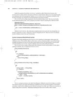
5. Click the Combo Box button and then click the Basic page. In the first Combo
Box Wizard dialog box, select the second option as shown in Figure 9-14.
Figure 9-14. Selecting the option to specify the combo options
6. In the next dialog box, enter the following values, as shown in Figure 9-15.
• <Any field>
• Author
• Title
• Description
CHAPTER 9 ENHANCING PRODUCT ADMINISTRATION
235
Figure 9-15. Specifying the allowed values
7. In the final dialog box enter Look In as the label text. Set the Name property of
this control to cbField. In the Data tab, set the Default Value property to “<Any
field>.” Set the Limit To List property to Yes. Set the Allow Value Lists Edits to
No. Drag the control to the second cell of the bottom row.
8. Add another ComboBox control to the Basic page. This time, in the Combo
Box Wizard, select the first option, which is to get the values from a table or
query.
9. In the second dialog box, select the Media table, as shown in Figure 9-16.
Figure 9-16. Selecting the Media table for the combo box source
CHAPTER 9 ENHANCING PRODUCT ADMINISTRATION
236
10. In the third dialog box, shown in Figure 9-17, select the MediaID and
MediaDescription columns to be included.
Figure 9-17. Selecting the columns to be included
11. In the fourth dialog box, shown in Figure 9-18, select the MediaDescription
field for the sort option.
Figure 9-18. Sorting by the MediaDescription column
12. The fifth dialog box, shown in Figure 9-19, shows a preview of what the Combo
Box will look like. Leave all the default settings.
CHAPTER 9 ENHANCING PRODUCT ADMINISTRATION
237
Figure 9-19. The Combo Box preview
13. In the final dialog box enter Include as the label text. Set the control’s Name
property to cbMedia. In the Data tab, set the Default Value property to 0. Set
the Allow Value Lists Edits to No. Drag the control to the fourth cell of the
bottom row.
This cbMedia Combo Box will allow you user to select one of the media types. You also want to
provide an option to include all of the media types in the search, which will require another row in the
dropdown list. To do that you’ll modify the query that populates this control.
1. Select the cbMedia control and in the Data tab of the Property Sheet, select the
Row Source property. Click the ellipses, which will launch the Query Builder.
Select the SQL View. Replace the existing SQL with the following code:
SELECT [Media].[MediaID], [Media].[MediaDescription] FROM [Media]
UNION SELECT 0, "<All media>" FROM [Media]
ORDER BY [MediaDescription];
Tip This SQL uses a UNION clause to add an additional hard-coded value to the values supplied by the Media
table. The value 0, with a description of <All media>, will indicate that the search should look in all media types.
2. Close the Query Builder and click the Yes button when prompted to update the
property.
3. Select all the labels and set the Text Align property to Right.
CHAPTER 9 ENHANCING PRODUCT ADMINISTRATION
238
4. Add a command button to each of the cells in the far-right column. Just cancel
the control wizards when they launch. For the top button, enter BasicSearch
for the Name property and Search for the Caption. For the lower button, enter
the BasicClear for the Name property and Clear for the Caption.
Save the form and enter the name ItemSearch when prompted. The layout of the Form Header
should look like Figure 9-20.
Figure 9-20. The layout of the Form Header
Note To add other search methods, such as the Advanced tab, you would add unbound controls for specifying
the search criteria. You then implement a Search button that formats a filter based on those criteria. I will leave the
implementation details for you to work out on your own.
Designing the Detail Section
Now you’ll design the results section of the ItemSearch form. It will use the Continuous Form View, so all
of the controls that you place here will be repeated for each record returned by the search. Just like with
the CustomerSearch form you created in Chapter 7, the detail section will contain data-bound controls.
You will limit the records that are displayed with a filter that is generated based on the specified search
criteria.
1. In the Property Sheet, select the Form object and the Data tab. For the Record
Source property select the Item table.
2. Set the following form properties:
• Filter On Load: Yes
• Allow Additions: No
• Allow Deletions: No
• Allow Filters: No
• Allow Edits: Yes (this is needed to be able to enter the search criteria)
• Default View: Continuous Forms
• Record Selectors: No
CHAPTER 9 ENHANCING PRODUCT ADMINISTRATION
239
• Navigation Buttons: Yes
• Close Button: No
• Filter: [ItemID] = CLng('0') (This will prevent items from displaying until
the search criteria is entered.)
3. In the Design tab of the ribbon, click the Add Existing Fields button. Double-
click the ItemID and Picture fields to add them to the Detail section. Delete
their associated labels. Prefix the Name property of both of these controls with
“txt.” For example, the Name property of the Picture control should be
txtPicture. Set the Visible property to both of these controls to No. Drag both
of these controls to the top-left corner of the Detail section.
4. Click the Add Existing Fields button in the ribbon. Double-click the following
fields to add them to the form and then delete the associated labels:
• Author
• Title
• Description
5. In the Other tab of the Property Sheet, change the Name property for all three
controls to prefix them with “txt.” For example, txtAuthor.
6. Select all three of these controls and set their Locked property to Yes to prevent
the user from modifying these fields.
7. With these controls still selected, from the Arrange tab of the ribbon, click the
Stacked button to create a layout control. Click the Insert Left button to add a
column to the left of the existing column. Merge all three cells of the left
column into one cell.
8. Select the entire layout, click the Control Padding button, and then click the
None link. This will remove the spaces between the controls.
9. Drag the layout to the top-left corner of the Detail section.
10. Add an Image control to the left cell of the layout. Set the Name property of
this control to imgPicture. In the Data tab, for the Control Source property
enter =GetFullImagePath([txtPicture]). This binds the Picture property of the
Image control to the txtPicture control that specifies the filename. The layout
should look like Figure 9-21.
Figure 9-21. The layout of the Detail section
CHAPTER 9 ENHANCING PRODUCT ADMINISTRATION
240
11. Right-click the Cancel button and click the Build Event link. This should
display the Macro Designer. The existing macro calls the Close Window action.
Change the Save parameter from Prompt to No. Save the macro changes and
close the Macro Designer.
12. Select the OK button. In the Event tab of the Property Sheet, change the On
Click property from Embedded Macro to Event Procedure. Change the Name
property to Close.
Adding the VBA Code
In the Design tab of the ribbon, click the View Code button, which will generate a code file for this form
and display the VBA Editor. Enter the code shown in Listing 9-3.
Listing 9-3. Initial Implementation of the ItemSearch Form
Private Sub Close_Click()
If (Me.CurrentRecord = 0) Then
MsgBox "Please select an item first", vbExclamation, "No Item Selected"
Else
Me.Visible = False
End If
End Sub
Private Sub Form_Current()
txtSelectedItemID = Me.ItemID
End Sub
Private Sub BasicSearch_Click()
Dim s As String
Dim sFilter As String
If (IsNull(Me.txtKeywords) Or Len(Me.txtKeywords) <= 1) Then
MsgBox "Please enter a keyword", vbExclamation, "No Keyword Specified"
Else
s = "*" + Me.txtKeywords + "*"
sFilter = "(([Author] Like '" + s + "' And ([Forms]![ItemSearch]![cbField] " & _
"= '<Any field>' Or [Forms]![ItemSearch]![cbField] = 'Author'))" & _
"Or ([Title] Like '" + s + "' And ([Forms]![ItemSearch]![cbField] " & _
"= '<Any field>' Or [Forms]![ItemSearch]![cbField] = 'Title'))" & _
"Or ([Description] Like '" + s + "' And ([Forms]![ItemSearch]![cbField] " & _
"= '<Any field>' Or [Forms]![ItemSearch]![cbField] = 'Description')))" & _
"And ([MediaID] = [Forms]![ItemSearch]![cbMedia] Or " & _
"[Forms]![ItemSearch]![cbMedia] = CLng('0'))"
DoCmd.ApplyFilter "", sFilter, ""
End If
End Sub
CHAPTER 9 ENHANCING PRODUCT ADMINISTRATION
241
Private Sub BasicClear_Click()
txtKeywords.Value = Null
cbField = "<Any field>"
cbMedia = cbMedia.DefaultValue
End Sub
The Cancel button simply closes the form. However, the event handler for the OK button
(implemented in the Close_Click method) merely hides the form. This allows the calling form to retrieve
the selected item. This is the same way that you implemented the CustomerSearch form.
In a Continuous Form, each record is displayed as a mini form which is repeated as many times as
necessary. When you click on a record, that specific “form” becomes the current one and the OnCurrent
event is raised. The Form_Current event handler takes advantage of this and captures the ItemID of the
selected record.
The BasicSearch_Click method is called when the Search button is clicked. It builds a filter string
based on the input criteria and then calls the ApplyFilter method. Unlike the CustomerSearch form, it is
assumed here that the only partial values are entered so the keyword is automatically prefixed and
suffixed with the “*” wildcard character. The BasicClear_Click method clears the txtKeywords control
and restores the default value for the ComboBox controls.
Testing the Search Function
Now you’re ready to try it out. Save the code file and the form changes, then switch to the Form View.
Enter a keyword or phrase and click the Search button. The form should look like Figure 9-22.
CHAPTER 9 ENHANCING PRODUCT ADMINISTRATION
242
Figure 9-22. The ItemSearch dialog
Using Conditional Formatting
You probably noticed that you can’t tell which item is selected. You could turn on the Record Selectors
property, which will display a black arrow next to the selected item. However, I’ll show you another way
to highlight the selected record, using the Conditional formatting feature.
1. Open the ItemSearch form in the Design View. In the Detail section, right-click
the txtAuthor control and click the Conditional Formatting link as shown in
Figure 9-23.
CHAPTER 9 ENHANCING PRODUCT ADMINISTRATION
243
Figure 9-23. Selecting the Conditional Formatting link
2. This will display the Condition Formatting Rules Manager, shown in Figure 9-
24. The txtAuthor control is already selected, and there are no rules currently
applied to this control. Click the New Rule button, which will display the New
Formatting Rule dialog box.
Figure 9-24. The Conditional Formatting Rules Manager
3. Select the first option since you’ll be using an expression and change the
combo box to Expression Is. For the expression enter the following code. The
txtSelectedItemID control is in the Form Header and the OnCurrent event
handler updates this to store the ID of the item that is currently selected. The
expression uses this to return True if the record being displayed has the same
ID as the selected record:
[txtItemID] = [txtSelectedItemID]
4. Finally, you need to specify in the rule what to do when the expression is true.
Click the Background Color dropdown and select a background. This will be
used when displaying the selected record. The completed rule should look like
Figure 9-25.
CHAPTER 9 ENHANCING PRODUCT ADMINISTRATION
244
Figure 9-25. The New Formatting Rule dialog box
5. Click the OK button to close the dialog box. The Conditional Formatting Rules
Manager will now show the rule that you just added.
6. Click the Apply button to save this rule.
7. Select the txtTitle control to see the rules defined for it, which should be
none. Click the New Rule button and create the exact same rule that you did
for the txtAuthor field.
8. In the same way, create a rule for the txtDescription control. All three controls
should have the same rule.
9. Click OK to close the rules manager and then save the form changes.
Open the ItemSearch form using the Form View and search for some items. The selected item
should be displayed in a different background, as shown in Figure 9-26.
CHAPTER 9 ENHANCING PRODUCT ADMINISTRATION
245
Figure 9-26. The ItemSearch form with conditional formatting
Invoking the ItemSearch Form
Now you’ll modify the Item form to use the ItemSearch form to select an item. This is a fairly simple
matter of adding a Search button to the Form Header that loads the ItemSearch Form. This will work just
like the customer search feature you implemented in Chapter 7.
1. In the Property Sheet, select the Form object and the Data tab. For the Filter
property, enter [ItemID] = CLng('0'). Also set the Filter On Loan property to
Yes. This will keep the form from loading the entire list of items. Instead, it will
only load the item selected from the ItemSearch form.
2. Open the Item form using the Layout View. The layout control for the Form
Header has two controls; an Image control that displays a logo and a Label that
displays the form title. Select the Label control and, from the Arrange tab in the
ribbon, click the Split Horizontally button. This will split the cell into two cells,
leaving an empty cell on the right.
3. Create a command button and put it in the empty cell. Cancel the control
wizard. Enter the Caption property as Search… and enter Search for the Name
property. Resize the cells so the Form Header looks like Figure 9-27.
CHAPTER 9 ENHANCING PRODUCT ADMINISTRATION
246
Figure 9-27. The modified Form Header with a Search button
4. Right-click the Search button and click the Build Event link. In the Choose
Builder dialog box select Code Builder. This will create an event handler for the
OnClick event and open the VBA Editor. Enter the code shown in Listing 9-4.
Listing 9-4. Implementation of the Search_Click Method
Private Sub Search_Click()
Dim sForm As String
Dim ID As Integer
sForm = "ItemSearch"
' Open the search form
DoCmd.OpenForm sForm, acNormal, , , , acDialog
' If the form is not loaded, the user clicked the Cancel button
If (IsLoaded(sForm)) Then
ID = Forms(sForm)!txtSelectedItemID
DoCmd.Close acForm, sForm
DoCmd.ApplyFilter "", "[ItemID] = CLng(" & ID & ")", ""
End If
End Sub
Private Sub Form_Load()
DoCmd.ApplyFilter "", "[ItemID] = CLng(0)", ""
End Sub
This code first opens the ItemSearch form. Because it is a modal dialog, the call does not return until
the form is closed or hidden. It then checks to see if the form is still loaded. If it is, it uses the
txtSelectedItemID control to get the ID of the selected item. It then applies a filter that returns only the
selected item.
This code also provides the implementation for the Form_Load method. Because the search feature is
manipulating the Filter property, Access tries to remember the last filter that was applied. This code
ensures that the initial filter is used when the form is started.
Open the Item form using the Form View. You should notice that no record is displayed. Click the
Search button, enter a search, select one of the items, and click the OK button. The ItemSearch form
should disappear and the selected item displayed in the Item form, as demonstrated in Figure 9-28.
CHAPTER 9 ENHANCING PRODUCT ADMINISTRATION
247
Figure 9-28. The Item form showing the selected item
Enhancing the Item Form
There are a few more enhancements that I want to show you. You may have noticed that there are no
inventory items for the item selected in Figure 9-28. The item has been set up in the database and the
author, title, and other details have been defined. But you don’t actually have a copy of it in your
inventory to lend out. You’ll add a facility to this form to receive a copy of the item and add it to the
inventory.
There is also a URL set up for this item where additional information can be obtained. You’ll add an
embedded web browser to this form and bind it to this URL. This will cause the browser to automatically
display that web page.
Finally, before we finish the chapter, I’ll show you how to add the item image to the Item On Loan
tab of the CustomerAdmin form. You implemented this in the previous chapter and left a place on the
form to display an image. You’ll add that to finish this page.
Adding an Inventory Item
Adding an inventory item is actually really easy to do. In Chapter 4 you created a query called
AddInventoryItem, which inserts a record into the InventoryItem table. It requires an ItemID parameter
so it knows which item to add. You’ll now add a command button to the Item form to run that query. For
a little variety, you’ll implement the logic behind the button with a macro.
CHAPTER 9 ENHANCING PRODUCT ADMINISTRATION
248
1. Open the Item form using the Layout View. Add a command button to empty
cell just to the right of the txtPicture control. Cancel the wizard when it starts.
Set the Name properties to AddInventory and the Caption property to Add
Inventory.
2. Right-click this control and click the Build Event link. In the Choose Builder
dialog, select Macro Builder, which will start the Macro Designer. This macro
will perform three actions:
• Suppress the normal Access warnings about records being updated
• Run the query
• Re-query the subform that lists the inventory items so it will refresh its
contents
3. The “Add New Action” dropdown list shows the actions that can be added to
the macro. Some actions are restricted if the document is not trusted. The
SetWarnings action is one of these. To be able to select this action, you must
first click the Show All Actions button in the ribbon, as shown in Figure 9-29.
Figure 9-29. The “Show All Actions” button
4. In the “Add New Action” dropdown list, select the SetWarnings action. Make
sure the Warnings On parameter is set to No.
5. For the next action, select the OpenQuery action. For the Query Name
parameter, select the AddInventoryItem query. This will display the itemID
parameter. Enter [ItemID] for its value.
6. For the last action, select Requery and enter InventoryItem for the Control
Name parameter.
The final macro design should look like Figure 9-30.
CHAPTER 9 ENHANCING PRODUCT ADMINISTRATION
249
Figure 9-30. The AddInventory macro design
Save the macro and close the Macro Designer. To test this, open the Item form using the Form View,
select an item and then click the Add Inventory button. A new record should be added to the subform, as
demonstrated in Figure 9-31.
Figure 9-31. A new inventory item added to the subform
Adding a Web Browser
Now you’ll add a WebBrowser control to the Item form. You’ll use the URL control to automatically
navigate to the associated web page.
1. Open the Item form in the Layout View. You’ll need to first create a cell to drop
the browser in. Select the InventoryItem subform, because it’s on the last row.
In the Arrange tab of the ribbon, click the Insert Below button add a new row.
Caution If the Insert Below button is not enabled, it’s probably because you clicked inside the subform,
selecting one of its cells. Try clicking on the border of the subform. The Property Sheet will indicate if you have
selected the
InventoryItem subform.
CHAPTER 9 ENHANCING PRODUCT ADMINISTRATION
250
2. The bottom row will have two cells, merge these together into one. Expand the
height of the cell to be about 5 inches.
3. In the Design tab of the ribbon, click the Web Browser Control button, as
shown in Figure 9-32.
Figure 9-32. Clicking the Web Browser Control button
4. Then select the large empty cell that you just created. Cancel the control
wizard when it starts. In the Property Sheet set the name of this control to
webBrowser.
5. Now you’ll add a couple of event handlers. Select the webBrowser control. In
the Event tab of the Property Sheet, for the On Navigate Error property, select
Event Procedure and click on the ellipses. Enter the following code for the
implementation. This simply navigates the web browser to a home page
should the specified URL be invalid.
webBrowser.Object.Navigate
6. While in the VBA Editor, add the following code to the Form_Current method:
If (Len(URL) > 0) Then
webBrowser.Object.Navigate URL
webBrowser.Visible = True
Else
webBrowser.Visible = False
End If
This causes the browser to navigate to the address specified by the URL field. If a URL is not specified,
the browser is hidden.
There is no place to type a URL so the user can’t navigate somewhere else. However, links on the
page could take them to other sites. If you want to control where they are navigating to, implement an
event handler for the OnBeforeNavigate event. To do so, in the Property Sheet, select the On Before
Navigate property, select Event Procedure and then click the ellipses. Add the following code for this
event’s implementation.
If (Left(CStr(URL), 17) <> "") Then
Cancel = True
End If
This code will prevent navigating to any URL that doesn’t start with “apress.com.”
CHAPTER 9 ENHANCING PRODUCT ADMINISTRATION
251
Note You might want to comment out this code and not leave it in your application. It is here for demonstration
purposes only.
Open the Item form in the Form View and search to one of the Apress titles. The embedded web
browser should display the associated page on the Access site, as demonstrated in Figure 9-33.
Figure 9-33. The Item form with the web browser enabled
Using Page Breaks
Now that you’ve added the web browser, the Item form has become too large to display all of it at once.
Of course you can scroll down to see the rest of the form. As an alternative, you can insert page breaks in
the form and then navigate between pages by using buttons.
1. Open the Item form using the Design View. From the Design tab of the ribbon,
click on the Page Break button, as shown in Figure 9-34.
CHAPTER 9 ENHANCING PRODUCT ADMINISTRATION
252
Figure 9-34. Clicking the Page Break button
2. Then click on the Item form, just above the webBrowser control. You should see
a series of dots, shown in Figure 9-35, which indicates a page break.
Figure 9-35.The page break indicator
3. Now you’ll add buttons to the Form Footer that the user can use to navigate to
each page. Click the Button button in the ribbon and then click on the Form
Footer. Cancel the control wizard. Set the Name property to Page1 and the
Caption property to Details. Right-click the control and click the Build Event
link. In the Choose Builder dialog box, select the Macro Builder.
4. In the Macro Designer, select the GoToPage action and enter the Page Number
parameter as 1. The macro should look like Figure 9-36. Save and close the
Macro Designer.
Figure 9-36. Implementing the Page1 button
5. In the same way, add another button named Page2 and set the Caption
property to Browser. Implement the button with a macro, setting the Page
Number parameter to 2.
6. Now you’ll need to arrange the buttons in a layout control. The Form Footer
should look like Figure 9-37.
Figure 9-37. The layout of the Form Footer
Save the form changes and switch to the Form View. You will have buttons at the bottom of the form
that you can use to easily switch between pages as shown in Figure 9-38.
CHAPTER 9 ENHANCING PRODUCT ADMINISTRATION
253
Figure 9-38. The Item form with page buttons
Modifying the CustomerLoan Form
The last thing you’ll need to do is modify the CustomerLoan form and add an image control.
1. Open the LoanDetail query in the Design View. Double-click the Picture field
in the Item table to add this column to the query. Save the query and then close
it.
2. Open the CustomerLoans form in the Layout View. Click the Add Existing Fields
button in the ribbon.
3. Drag the Picture field to the empty cell underneath the Renew button. This will
insert a new column for the associated label. Right-click the label and click the
Delete Column link.
4. Change the Name property of the Picture control to txtPicture. Set the Visible
property to No.
5. In the Design tab of the ribbon, click the Image button and then click in the
Detail section. Cancel the control wizard. Drag this control to the empty cell on
the right side of the form. Set the Name property to imgPicture.
6. In the Data tab of the Property Sheet, set the Control Source property to
=GetFullImagePath(txtPicture).
7. Save the form.
CHAPTER 9 ENHANCING PRODUCT ADMINISTRATION
254
To test the change, open the CustomerAdmin form using the Form View, select a customer and select
the Item On Loan tab. The form should look like Figure 9-39.
Figure 9-39. The modified CustomerAdmin form
Summary
In this chapter you made some significant enhancements to the Item form, including:
• Adding images to the item data
• Providing a search facility to look for items in the database
• Embedding a web browser for additional item information
Some of the other Access techniques that you learned include:
• Importing tables from another Access database
• Using conditional formatting
• Calling an action query from a command button
• Using page breaks
In the next chapter, you will make changes to this application to prepare it for the end users. This will
include creating a navigation form and locking down the design and development features.
C H A P T E R 10
255
Enhancing the User Experience
At this point, you have developed a well-functioned application and you’re ready to turn it over to the
end users… well, not quite yet. When you open the Access file, there are lots of neat things like tables
and queries, macros, and VBA – all the sorts of items that we developers like to work with. Most end
users are not going to want to see this. More important, if you have to support it, you don’t want them
seeing it either, much less have the ability to change any of it.
In this chapter, I’ll show you some ways to package the application with the end user in mind. The
first step is to provide a way for them to navigate to the forms that they will be using. I’ll demonstrate
two ways to accomplish this using a custom navigation form and a custom ribbon. With that in place,
you’ll then need to remove the standard navigation and lock down the application to prevent unwanted
alterations.
Form Navigation
When the application is first loaded, you will need some sort of “welcome” form that will present to the
user their choices of things they can do such as check out a customer, look for an item, and so on. Access
2010 provides a really nice facility for creating a navigation form by simply dragging the forms and
reports to the appropriate navigation structure. However, the complex forms you have developed so far
will not work with this technique. Essentially, the navigation form becomes the main form and all your
other forms are added as subforms. As I explained in Chapter 8, there are limitations with subforms. For
example, you cannot use a Split Form as a subform.
Note I will demonstrate the built-in Navigation Form template in Chapter 15. You will use this to organize the
web forms.
So you’ll need to create your own custom navigation form. Fortunately, this is simple to do – almost
surprisingly so. The hardest part is usually deciding what options should be allowed and how to best
organize them. Although there is no right way to organize these, I suggest the following structure:
• Operations (tasks that you do all day long)
• Checkout a customer
• Set up a new customer or view/modify an existing one
• Lookup an item
CHAPTER 10 ENHANCING THE USER EXPERIENCE
256
• Administration (updating configurable objects)
• Items
• Categories
• Media types
• Maintenance (routine tasks for ongoing support and maintenance)
• Calculate late fees
• Cancel old requests
Creating the Menu Form
You’ll create a blank form and place command buttons on it. You can take advantage of the control
wizards that will set up a macro to open the associated form when the user clicks a command button.
You will use a TabControl to organize the buttons into the three top level items (Operations,
Administration, and Maintenance).
1. Click the Blank Form button in the Create tab of the ribbon.
2. In the Design tab of the ribbon, click the Tab Control button, and then draw a
rectangle on the form. This will create a TabControl with two pages. Right-click
this control and click the Insert Page link. Select each page and set the Name
property of each to Operations, Administration, and Maintenance. The form
should look like Figure 10-1.
Figure 10-1. The initial Menu form layout
3. In the Property Sheet, select the Form object and set the Record Selectors and
Navigation Buttons properties to No. These are not applicable for this form,
because it does not access a table.
CHAPTER 10 ENHANCING THE USER EXPERIENCE
257
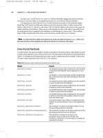
Tip Make sure that the control wizards are turned on. To check, click the dropdown icon near the bottom-right
corner of the Controls section of the ribbon. This will show all of the available controls. The icon next to the Use
Control Wizards icon should be highlighted as shown in Figure 10-2. If not, click the Use Control Wizards link to
turn them on.
Figure 10-2. Checking the status of the control wizards
4. Click the Button button and then click the Operations page. This will launch
the Command Button Wizard. In the first dialog box, select the OpenForm action
as shown in Figure 10-3.
Figure 10-3. Selecting the OpenForm action
5. In the second dialog box, select the CheckOut form, as shown in Figure 10-4.
CHAPTER 10 ENHANCING THE USER EXPERIENCE
258
Figure 10-4. Selecting the CheckOut form
6. The third dialog box, shown in Figure 10-5, provides an option to filter the
record when opening the form. This doesn’t apply in this scenario, so select
the second option, which is to show all records.
Figure 10-5. Selecting the option to show all records
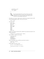
7. The fourth dialog box is used to specify the text or picture that should be
displayed on the button. Select the Text option and enter Check Out, as shown
in Figure 10-6.


