Creating Applications with Mozilla-Chapter 3. XUL Elements and Features- P2
Bạn đang xem bản rút gọn của tài liệu. Xem và tải ngay bản đầy đủ của tài liệu tại đây (34.6 KB, 12 trang )
Chapter 3. XUL Elements and Features- P2
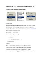
Figure 3-3. Visual comparison of menu widgets
3.3.2.1. Menus
Menus are much more flexible than they first appear to be. They can appear
anywhere in the UI, for one thing, and needn't be stuck at the top of the
window. They can be in buttons, trees, or just out on their own. Example 3-6
shows the basic structure of a menu.
Example 3-6. A sample menu
<menu label="Quantity">
<menupopup>
<!-- menuitems here -->
</menupopup>
</menu>
There is a rigid ordering of nesting in a menu. A menu contains a
<menupopup>, which in turn contains one or more menu items.
Optionally, you can segregate groups of menu items by using a
<menuseparator> in the pop up, which draws a thin line between items.
3.3.2.2. Pop ups
The pop up manifests as either a <menupopup> or a <popup> element.
The latter can be used in a number of different ways, but Example 3-7
focuses on its common use in context menus.
Example 3-7. Context menu using pop up
<popup id="FlyContext"
onpopupshowing="return doThis( );"
onpopuphiding=" return doThat( );">
<!-- menuitems here -->
</popup>
A couple of extra steps are needed to prepare a context pop up for activation.
First, you must attach the popup element to a widget in the UI by using the
id of the pop up that must correspond to the context of the widget:
<toolbar id="main-toolbar" context="FlyContext" />
When the toolbar is clicked, the pop up that corresponds to that value
appears. You can have some script execute when you show and/or hide the
pop up by using the onpopupshowing and onpopuphiding methods,
as when you show and hide items in a dynamic menu.
The second step includes the pop up in a set of pop ups, enclosed in a
<popupset> element. Though not strictly necessary as a container for pop
ups, the pop-up set helps organize the free-floating[1]
pop-up windows in
your application and makes it easy to overlay them or overlay into them as
the situation requires.
3.3.2.3. Menu lists
Another manifestation of the pop up is in the use of menu lists. A menu list
is a choice of options presented to solicit a single choice, usually in the form
of a drop-down menu, for which XUL provides the <menulist> element.
Example 3-8
presents a straightforward menu list with a selection of items to
choose from. As in the other pop-up examples, selecting an item executes
the code defined in the oncommand event handler for that item (e.g.,
changeF(1) for the menu item "Tachinidae").
Example 3-8. XUL menu list
<menulist id="FlyInput">
<menupopup>
<!-- menuitems here -->
</menupopup>
</menulist>
The menulist widget provides functionality beyond that of a regular
menu. The menu list can be made editable when the user should be allowed
to enter a value not represented in the menu items. In this case, the
menulist element definition in Example 3-8
would change to something
such as:
<menulist id="FlyInput" editable="true"
oninput="onInputFly( );"
onchange="onChangeFly( );">
A true value on the editable attribute allows input in the list. Input can
be validated immediately by using the oninput attribute. The addition of
the onchange attribute can be used to carry out an extra script when a new
selection is made.
Notes
[1]
Free-floating because their location in the interface is not determined by
their position in the XUL markup, as it usually is for items like menus
and buttons.
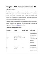
3.4. Tabular and Hierarchical Information
Many options exist to display hierarchical information in your user interface.
The most common are tree-like and table-like structures, both of which are
represented by elements in Mozilla's XPFE toolkit. In this section, we look
at list boxes, trees, and grids. With the exception of the tree, these elements
are not limited in regard to the content they can contain. Currently, the tree
only holds text and image content and grids are designed for holding the
more diverse content as shown in upcoming examples.
3.4.1. List Boxes
<listbox> is used to display tabular data. Example 3-9
shows a
listbox widget with all the basic features, including the definition of the
number of columns (listcol), the listbox header (listhead), and a
list item (listitem).
Example 3-9. Listbox widget
<listbox rows="5" class="list" id="FlyTree"
onselect="SelectFly( )">
<listcols>
<listcol flex="1"/>
<splitter class="tree-splitter"/>
<listcol flex="1"/>
</listcols>
<listhead>
<listheader label="Name" />
<listheader label="Type" />
</listhead>
<listitem id="type-d">
<listcell label="Syrphidae" />
<listcell label="flower" />
</listitem>
<!-- More Items -->
</listbox>
The first thing of note in the markup in Example 3-9
is the rules for the
nesting of elements within a listbox structure. The number of columns
needs to be set, each with a <listcol> element, and all have to be
wrapped in a <listcols> set. Example 3-9
has two columns. They are
separated by a draggable grippy item, which also acts as a column
separator in the header row. The cells for those columns are contained in a
<listitem> grouping. The header is optional and has the same structure
as a list item. Once you've put a hierarchy like this in place, you can put the
content you want into the tabular structure.


