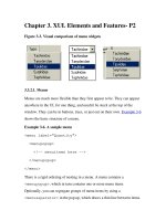
Creating Applications with Mozilla-Chapter 3. XUL Elements and Features- P6
Bạn đang xem bản rút gọn của tài liệu. Xem và tải ngay bản đầy đủ của tài liệu tại đây (45.42 KB, 19 trang )
Chapter 3. XUL Elements and Features- P6
3.11. Overlays
An overlay is a separate file in which additional XUL content can be defined
and loaded at runtime. Overlays are often used to define things like menus
that appear in different components or parts of the application.
If you are creating a large application or a UI with many elements as a part
of your design, the files can easily become large. The size in itself does not
render it ineffective, but it does make the job of the developer a little
difficult when tracking down and changing features. The best way to
overcome this size problem is to use overlays. Another reason to use
overlays is to extract information from a certain logical portion of the UI and
contain it in a file of its own. This extraction and containment promotes
modularization and reusability.
3.11.1. How to Use Overlays
The following declaration is the principal method for including reusable
content in a XUL window.
<?xul-overlay
href="chrome://global/content/globalOverlay.xul"?>
This declaration follows the same syntax as CSS processing instructions.
Like other XML processing instructions, it uses a ? at the beginning and
end, just inside the braces. The href attribute points to the overlay and uses
Mozilla's chrome:// type URL.
To insert content from an overlay, use the same id of an element in the
"base file" for a similar element in your overlay content, and the overlay will
replace the base file at runtime (or be merged with it, as described later in
this chapter in the Section 3.11.2
section).
When the base element is empty, it is replaced with the corresponding
overlay element and any child subcontent. The following toolbar snippet
shows a reference placed in a base file:
<toolbar id="main-toolbar" />
When an overlay is read with the content below, the previous line is replaced
with that content:
<toolbar id="main-menubar" persist="collapsed">
<toolbarbutton id="new-button" label="New"
observes="cmd_new"/>
<toolbarbutton id="open-button" label="Open"
observes="cmd_open"/>
<toolbarbutton id="save-button" label="Save"
observes="cmd_save"/>
</toolbar>
Overlay files are XUL files with a .xul extension. The content within that
file has to be contained in an <overlay> element, which is the root of the
document. For example, the toolbar is a first level child of the root.
<overlay id="xflyOverlay">
<toolbar id="main-toolbar" />
<!-- more overlay content -->
</overlay>
//FIXME did we loose content here?
Styles from overlays override styles from base XUL files, so be careful
not to load master styles in an overlay.
3.11.1.1. Dynamic loading
The usual method for loading overlays, as outlined previously, is to include
the overlay processing instruction in your XUL file. The dynamic loading of
content is more subtle, but just as effective. Mozilla has a registry of
overlays, in the form of an RDF datasource that lives in the chrome
directory. These overlays live in the tree in a directory called overlayinfo
under the chrome root.[1]
When a new package or component is registered,
the overlays that come with it are loaded automatically.
Dynamic overlays are commonly used to extend certain parts of the Mozilla
application itself when new packages are installed that need access points, as
do new language packages and themes, for instance. Certain menus in the
UI, for example, are open for third-party authors to add items. Adding the
name of your package to Mozilla's Tasks menu, for example, provides a
convenient launching point and is handled with dynamic overlays. Chapter 6
provides more information on this topic, in the section Section 6.2.3.3
.
3.11.2. Content Positioning
Content positioning is the order in which widgets appear in the UI. Usually
content is laid out in the order elements are defined in the XUL file.
However, there are a couple of ways to override this ordering in XUL.
Continuing with the example of the overlaid toolbar in the previous section,
it is possible for both the base definition and the overlaid definition to have
children. In this instance, the content is merged, with the original content
appearing before the overlaid content by default:
<toolbar id="main-toolbar">
<toolbarbutton id="print-button" label="Print"
observes="cmd_print"/>
</toolbar>
If the toolbarbutton above is in the base XUL, then the ordering of the
buttons would be Print, New, Open, and Save. It is possible to change this
ordering by using insertbefore, however, as shown in Example 3-21
.
Example 3-21. Positioning attributes
<toolbar id="main-toolbar" persist="collapsed">
<toolbarbutton id="new-button" label="New"
observes="cmd_new"
insertbefore="print-button"/>
<toolbarbutton id="open-button" label="Open"
observes="cmd_open"/>
<toolbarbutton id="save-button" label="Save"
observes="cmd_save"
position="2"/>
</toolbar>
The insertbefore attribute is placed on one of the child items to signify
that it should go before a sibling in the base file. insertbefore takes an
element id as a value and says, in this case, that the New button should go
before Print. Conversely, you can move an item after it by using the
insertafter attribute. For more precision, you can use position to
position an item absolutely in the sequence of siblings. In Example 3-21
, the
position attribute puts the Save button in the second position, so the final
order is New, Save, Print, and Open.
Notes
[1]
Chapter 9 has more information on RDF datasources. To delve deeper
into the chrome layout and install issues, see Chapter 6
.
3.12. The Extras
Certain lesser-known elements and features are indispensable to the savvy
XUL developer and can add that something extra to Mozilla applications, as
shown here.
3.12.1. Tooltips
Tooltips are visual pop ups that appear when you place the cursor over a
piece of the UI. The hovering behavior of a tooltip is useful for many things,
including abbreviated help and the display of values that are otherwise
obscured in the UI. In the Mozilla application, the most common places
where they are used are on toolbar buttons and splitter grippies that divide
panels in the window.
To invoke a tooltip, add a tooltiptext attribute to the widget that needs
it:
<button id="printButton" label="Print"
tooltiptext="Print this page" />
Defining this attribute is enough to ensure that the generic Mozilla tip box
appears with the specified text when you place the cursor over the element.
Tooltips are actually implemented as an XBL binding. Underneath, a tooltip
is essentially a pop up with a description element within that holds text.
You can also create your own tooltips.
To create your own content and customized appearance for a tooltip:
1. Create the content.
2. Attach it to the pop-up element you will be using.
3. Give the pop up a unique ID.
The following snippet shows the kind of tooltip you can create and then
reuse in your application code:
<popupset id="aTooltipSet">
<popup id="myTooltip"
class="tooltip"
onpopupshowing="return
FillInTooltip(document.tooltipNode);" >
<description id="TOOLTIP-tooltipText"
class="my-tooltip-label" flex="1"/>
</popup>
</popupset>
Use your newly created widget by adding its id value to the tooltip
attribute to the UI element that wants it:
<treeitem id="FlyDescription" tooltip="myTooltip"
tooltiptext="" />
Note that this example assumes that the actual text will be applied
dynamically to the tooltiptext attribute, which is initially empty. This
is useful in many situations -- for example, in tree cells that contain transient
values.
The advantage of creating your own tooltip is that you can apply your own
styles to it, giving the text and background whatever font and colors you
want. A variation of the tooltip attribute named contenttooltip is
used for content panels.
3.12.2. Progress Meter
Sometimes in your application you need to give the user feedback during a
long operation. The classic example in the browser is the status bar that
shows a visual representation of the time remaining when you load a big
web page or download a file.
Of these two activities, loading pages and downloading files, downloading
uses the determined mode, meaning that the time to complete the operation
is calculable. In this case, an algorithm is written based on the file size and
the bandwidth values to formulate the time remaining. The second of three
modes of a progress meter is the undetermined mode, in which the time for
the operation to complete is unknown. Commonly called the "barber pole,"
the progress meter shows a spinning pole when in undetermined mode. The


