Creating Applications with Mozilla-Chapter 3. XUL Elements and Features- P5
Bạn đang xem bản rút gọn của tài liệu. Xem và tải ngay bản đầy đủ của tài liệu tại đây (51.54 KB, 15 trang )
Chapter 3. XUL Elements and Features- P5
3.9.1. Box Attributes
The XUL element <box> defines a number of attributes and some implicit
behavior for layout. Boxes can be oriented within other boxes to define the
general layout of the UI. Some boxes stretch to fit the space available within
the top-level window or their containing element; others take only as much
space as needed to display their own children.
Attributes on the box and its child elements determine the flexibility of the
content contained within the box, the way that windows are resized, and the
alignment of elements, as Table 3-4
describes.
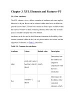
Table 3-4. Common box attributes
Attribute Values Default value Description
align
start | end | center |
baseline | stretch |
inherit
stretch
Determines how
the children are
aligned in
conjunction with
the box's
orientation
flex
<number> |
inherit
0.0
Determines the
flexibility of the
contained
elements, which
Attribute Values Default value Description
depends on their
particular flex
values
style
CSS property and
value
N/A
Applies CSS style
settings to the box
orient
horizontal |
vertical | inline-
axis | block-axis |
inherit
inline-axis
Determines the
layout of the
children of the
box
pack
start | end | center |
justify | inherit
start
Determines the
use of remaining
whitespace once
all other objects
are stretched to
their full size
direction
normal | reverse |
inherit
normal
Determines the
direction of the
children in the
box
ordinal-group <integer> | inherit 1
Controls the order
in which widgets
Attribute Values Default value Description
appear in a box
The attribute names in Table 3-4 (with the exception of style) are defined
directly on the box. But there are also CSS versions of these properties that
use the prefix box-. pack becomes box-pack when it's defined in CSS,
for example. These properties are not part of the CSS specification, so you
may need to go one step further and use the format -moz-box-pack.
These special extensions to CSS are described in the section Section 4.2.3
in
Chapter 4
.
The most commonly used attributes are orient, align, and pack. The
orientation of the children of a box can be either vertical or horizontal. The
default is horizontal for a plain <box>, but not for all box containers
(<groupbox> is vertical). The <vbox> and <hbox> conveniences were
created to bypass the use of this attribute and increase box layout efficiency
in the rendering phase.
Here is a look at how the pack and align properties can effect the layout of
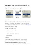
widgets. First, here is a bit of code with no constraints:
<vbox style="width: 90px; height: 90px">
<button label="Pack Me!" />
<label value="This text is naturally aligned to
the left" />
</vbox>
This XUL does not tell the button and text inside where to go, so they
occupy the default positions shown in Figure 3-9
.
Figure 3-9. Default box positioning
Here is a changed box definition with the align and pack attributes set:
<vbox style="width: 90px; height: 90px"
align="right" pack="center">
A noticeable visual difference can be seen in Figure 3-10
.
Figure 3-10. Box packing and alignment effects
The align value moves the items to the right of the box, while
simultaneously constraining the button to fit only the text label, making
better use of space. pack centers both the items horizontally.
3.9.2. Box-Like Containers
The basic XUL box is represented by the <box>, <vbox>, and <hbox>
elements, but several more XUL elements are designed as box-like
containers. They include:
•
<radiogroup>
•
<scrollbox>
•
<tabbox>
•
<groupbox>
•
<toolbox>
•
<stack>
•
<deck>
•
<listbox>
•
<popup>
•
<statusbar>
Descriptions of the tabbed box and the group box follow. Additional
information on other box widgets can be found in the XUL element
reference in Appendix C
.
3.9.2.1. Tab box
Tab boxes may contain only <tabs> and <tabpanels> elements, as
shown in Example 3-16
. Beyond this, there is no restriction on the content
that can go into the panels themselves. For the panels to display content
properly, there have to be the same number of children and tabs in the tab
panels.
Example 3-16. Tabbed panels
<tabbox orient="vertical" flex="1">
<tabs>
<tab label="Fish" />
<tab label="Birds" />
<tab label="Coders" />
</tabs>
<tabpanels flex="1">
<button label="Swim"/>
<button label="Fly"/>
<button label="Hack"/>
</tabpanels>
</tabbox>
Example 3-16
shows the main controls used to create a simple three-tab
control with content elements on each panel. The tabs are associated with the
appropriate panels by their order within the containing element.
3.9.2.2. Status bar
A status bar is a horizontal box that appears on the bottom of the screen in
many Mozilla applications, including the Mozilla browser itself. It can be
used for the same purpose in your application if you need it. The
<statusbar> element typically contains icon images and text within one
or more <statusbarpanel> elements:
<statusbar id="ch3-bar" persist="collapsed">


