Creating Applications with Mozilla-Chapter 3. XUL Elements and Features- P4
Bạn đang xem bản rút gọn của tài liệu. Xem và tải ngay bản đầy đủ của tài liệu tại đây (57.34 KB, 16 trang )
Chapter 3. XUL Elements and Features- P4
Figure 3-7. Checkbox widget
Clicking on the box sets the checked attribute, for which the check
indicates a positive value. You can set this attribute in script to give the
checkbox an initial value.
3.6.3. Buttons
A button is a multipurpose widget that commonly lives in toolbars and
dialog boxes. The two button elements, <button> and
<toolbarbutton>, are essentially the same. Often only the class
attribute values distinguish the two. You can use a <toolbarbutton>
outside a toolbar or use a <button> inside a toolbar, though in practice,
the two usually stay in their respective domains. This flexibility has the nice
effect of letting you get the buttons in a particular area by using the
getElementsByTagName method with, for example, the tag name
"button."
A common form of the button contains text and an image, with image on the
left and the text to the right by default. However, you may want to take
advantage of some of the classes available in Mozilla to define a different
orientation, or you can simply write your own style rules for your buttons.[1]
The text that appears on the button is contained in the label attribute and
shown in this example:
<button id="newfileBtn"
tooltiptext="New File"
oncommand="doNew( )"
label="New"/>
You can associate the image with the button using the src attribute, but the
more common way is to use the list-style-image style rule in CSS,
as in the following snippet of code that uses the id style selector:
#newfileBtn
{
list-style-image:
url("chrome://editor/skin/images/newfile.gif");
}
3.6.3.1. Button types
Mozilla provides more than the standard "click" and "go" buttons in its
toolkit. Table 3-3
describes the various button types in Mozilla.
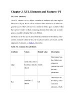
Table 3-3. Button types
Type Usage Description
Menu type= "menu"
Menu integrated into the
button with small arrow
icon
Dual Menu type= "menu-button"
Menu appears distinct
from the button, in
separate clickable area
Checkbox type= "checkbox"
When selected, remains
Type Usage Description
in a depressed state and
toggles back to its
natural state when
selected again
Radio type= "radio"
Designed to be part of a
group; only one button is
selectable at a time
Disclosure dlgtype= "disclosure"
Shows/Hides a portion
of a dialog window
Default dlgtype= "accept"
Performs the default
action for a dialog
Cancel dlgtype= "cancel"
Closes the dialog and
does not carry out the
default action
Help dlgtype= "help"
Activates context-
sensitive help
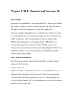
Taking one of the button types in Table 3-3 as a mini-case study, you could
use a button with the type menu-button to display more than one option
at a time. The default orientation for this type of button is for the menu to be
to the right of the button. Mozilla uses buttons of type menu-button for
its back and forward buttons, in which the menu items hold previously
visited pages. Figure 3-8 shows the appearance of the browser's back button
displaying the last several pages viewed.
Figure 3-8. menu-button for browser's back functionality
Other possible uses include options for different variations of the same
feature, such as a New button that displays New File, New Project, or New
Template options. The button action is the default option and the
menuitems contain the rest of the choices.
3.6.3.2. Dialog buttons
The last four items in Table 3-3
are button types that make most sense in,
and were designed especially for, dialog windows. The easiest way to
include them in dialogs is to use the buttons attribute on the <dialog>
element, which displays them automatically, as shown here:
<dialog
xmlns=" />there.is.only.xul"
buttons="accept,cancel,help"
buttonpack="center"
ondialogaccept="return onAccept( );"
ondialogcancel="return onCancel( );"
ondialoghelp="return doHelpButton( );">
The functions activated when these buttons are clicked on are defined in the
ondialogaccept, ondialogcancel, and ondialoghelp event
handler attributes. These event handler shortcuts are best if you simply want
to inherit the default button text (Ok, Cancel, and Help). In cases when you
want your own text, or want some extra control over the scripting, you can
define your own button with the dlgtype attribute:
<button dlgtype="accept"
label="Go For It!"
oncommand="doExtraFunction( )"/>
The buttonpack attribute determines whether the buttons appear on the
right, left, or center of the window. If no value is given, the default platform
orientation takes effect. On Windows, the default is the right, and on Unix,
it's the center.
Notes
[1]
Unfortunately, button skins and the class attributes that associate
them with button widgets change too often to list here. Some classes like
"toolbar-primary" tend to be reused often for buttons in Mozilla, but the
best way to find and use classes is to consult the source code itself or to
create your own.
3.7. Widget Interaction
At a level above the use of widgets for different, singular functions in the
application interface, Mozilla provides tools for hooking things together and
creating application logic that can make your interfaces work more
consistently and handle more complex tasks. If you have different elements
in your application that execute the same function, for example, the
command and observer system is the ideal way to facilitate reuse. Or you
can use command sets to define command sets and key sets that can be
overlaid and made available in different parts of your application, similar to
how the cut and paste commands and others are spread over the Mozilla user
interface but defined in a centralized file.
3.7.1. Broadcaster and Observers
Broadcasters and observers are a mechanism for making any number of
elements aware of state and event information from a single, "broadcasting"
element. That broadcasting element can be an actual <broadcaster> or a
regular element that broadcasts its state with special attributes. A common
example of broadcasting is the disabling of a group of elements -- a menu
item and a separate button for viewing source, for example -- when the
source for a web page is not available.
The state of a broadcaster has to be changed explicitly for its observers to be
updated:
<broadcasterset>
<broadcaster id="save_command" disabled="false"/>


