Thiết kế flash với flash cs5 part 70
Bạn đang xem bản rút gọn của tài liệu. Xem và tải ngay bản đầy đủ của tài liệu tại đây (771.27 KB, 6 trang )
ptg
430
Chapter 18
The power of a component is its ability to
change. Components can be modified directly
in the Component Inspector panel, or they
can be modified dynamically, as the Flash
movie runs. The Component Inspector panel
has three areas to modify a component—
Parameters, Bindings, and Schema. These
three tabs allow you to attach components to
data files, change or modify the text on a but-
ton, or create drop-down menus and lists.
Setting Parameters Options
After adding an instance of a component to a
Flash document, you can name the instance
at the top of the Property Inspector, and then
specify the parameters for the instance using
the options and fields under Component
Parameters in the Property Inspector (
New!
).
Each component has parameters that you
can set to change the instance’s appearance
and behavior. A parameter is a property or
method that appears in the Property
Inspector. The most commonly used proper-
ties and methods appear as authoring param-
eters; others can be set using ActionScript.
Authoring parameters represent common
things such as the label attached to a Button
component, or items displayed when using
the List component. If you set a parameter
using ActionScript, it will override any value
set while authoring.
Understand that each component will have
its own unique parameters, and changing
parameters in the Property Inspector only
changes the selected instance. Parameters
include the ability to change an instance's
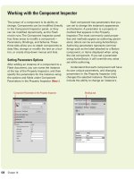
Working with the Component Inspector
Component Parameters in the Property Inspector Bindings tab
From the Library of Wow! eBook
ptg
Chapter 18 Adding and Modifying Components
431
that the Bindings tab needs in order to handle
your data correctly. For example, you can click
the Schema tab, define the binding compo-
nent (DataGrid), and then use the Bindings
tab to link the DataGrid component to the
external XML file.
The top portion of the Schema tab dis-
plays bindable properties associated with the
selected component, while the bottom portion
of the Schema tab displays detailed informa-
tion about the selected schema item (selected
from the top portion of the Schema tab), and
gives you the ability to view or edit them.
font, color, and size. You can add additional
parameters by selecting the instance on the
Stage and typing the script into the Actions
panel. If you add the script to Frame 1 in the
Timeline, you can create global changes to
instance parameters.
Setting Binding Options
Data Binding is a concept where the property
of one component can be bound to the
property of another component: if the prop-
erty of the one component changes, so will
the property of the other component or com-
ponents. The Bindings tab defines a link
between two endpoints, a source (external
data file, movie clip, graphic) and a destina-
tion component (DataGrid, Loader, Label). It
listens for changes to the source endpoint
and copies the changed data to the destina-
tion endpoint each time the source changes.
Setting Schema Options
Schemas are important because they help
create a communication link between other
components, using the Bindings tab. A com-
ponent's schema simply represents the prop-
erties and fields that are available for data
binding. Each property or field contains set-
tings that control validation, formatting, type
conversion, and other features that affect how
data binding and the data management com-
ponents handle the data of a field.
The Schema tab lets you view the schema
for the selected component. Schema is basi-
cally a list of the component's binding proper-
ties, their data types, their internal structure,
and other special attributes, depending on the
selected component. This is the information
Schema tab
From the Library of Wow! eBook
ptg
432
Chapter 18
The TextInput component works with the ActionScript TextField object.
Once a TextInput component is added to the Stage, you can use styles
to customize the font, size, and color. A TextInput component can be
formatted using HTML, or even as a password field that disguises the
text. When a TextInput field has focus, visitors can use the arrow keys
to move through information in the field, and they can use the tab key
to move the focus to the next object, or Shift+Tab to move to the previ-
ous object. TextInput fields can be used to hold information. For exam-
ple, you could use a group of TextInput components as the basis for
creating an interactive form for fields such as: name, address, city,
state, and zip code.
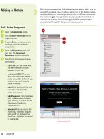
Adding a Text Input
Add a TextInput Component
Open the Components panel.
Click the User Interface arrow to
expand the list.
Drag the TextInput component
onto the Stage, and then select the
component.
Open the Properties panel, and
then click the Component
Parameters arrow to expand it.
Select from the following Text
Input parameters:
◆
editable. When you select the
check box, the field can be
edited. If you select false, the
field can be selected but not
edited.
◆
password (2.0) or display
AsPassword (3.0). When you
select the check box, text
entered into the field appears
as dots. If you select false, text
typed into the field appears as
typed.
◆
text. Click the Value field, and
then enter the text that will
appear in the field when the
Flash document opens.
5
4
3
2
1
1
2
3
From the Library of Wow! eBook
ptg
Chapter 18 Adding and Modifying Components
433
◆
maxChars. Click the Value field,
and then enter a numerical
value indicating the max
characters allowed in the
TextInput field.
◆
restrict. Click the Value field,
and then enter any characters
that cannot be entered into the
TextInput field.
◆
enabled. When you select the
check box, the field can be
edited. If you select false, the
field appears grayed out and is
not selectable or editable.
◆
visible. When you select the
check box, the field can be
viewed. If you select false, the
field is invisible.
◆
minHeight (2.0). Click the Value
field, and then enter a minimum
height for the TextInput box.
◆
minWidth (2.0). Click the Value
field, and then enter a minimum
width for the TextInput box.
Click the Control menu, point to
Test Movie, and then click Test.
IMPORTANT
Although you can
change the size of any component
using the Free Transform tool,
since the TextInput component is a
single-line component, changing
its height does not impact how
many lines of text you can type.
6
TextInput
component
5
4
From the Library of Wow! eBook
ptg
434
Chapter 18
The ComboBox component creates a drop-down list of selectable
options. They can be either static or editable. The static ComboBox
component allows a user to make a single selection from a drop-down
list. An editable ComboBox component lets users enter text into a text
field located at the top of the list, as well as selecting an item from a
drop-down list. A ComboBox component is composed of three subcom-
ponents: Button, TextInput, and List components. When a visitor selects
an item, the label of the selection is automatically copied to the text
field at the top of the combo box. The ComboBox component is an
excellent way to offer several choices to a user, without the necessity
of them having to type in a response. For example, a ComboBox could
be used to list all of the states in the union in a drop-down box, giving
the user the chance to select his home state. When the ComboBox dis-
plays in a Flash document, it appears as a single line; clicking the trian-
gle to the right of the line expands the box and displays all the available
options.
Adding a Combo
Text Box
Add a ComboBox Component
Open the Components panel.
Click the User Interface arrow to
expand the list.
Drag the ComboBox component
onto the Stage, and then select the
component.
Open the Properties panel, and
then click the Component
Parameters arrow to expand it.
Select from the following
ComboBox parameters:
◆
data (2.0) or dataProvider (3.0).
Click the Edit button, and then
enter an array in the Values
dialog box. Click the plus (+)
sign to add values and the
minus sign (-) to remove a
value. Data values are used to
populate the drop-down list.
◆
editable. When you select the
check box, the field can be
edited. If you select false, the
field can be selected but not
edited.
5
4
3
2
1
1
2
3
ComboBox component
From the Library of Wow! eBook


