Thiết kế flash với flash cs5 part 71
Bạn đang xem bản rút gọn của tài liệu. Xem và tải ngay bản đầy đủ của tài liệu tại đây (815.94 KB, 6 trang )
ptg
436
Chapter 18
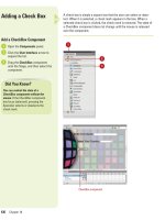
A check box is simply a square box that the user can select or dese-
lect. When it is selected, a check mark appears in the box. When a
selected check box is clicked, the check mark is removed. The state of
a CheckBox component does not change until the mouse is released
over the component.
Adding a Check Box
Add a CheckBox Component
Open the Components panel.
Click the User Interface arrow to
expand the list.
Drag the CheckBox component
onto the Stage, and then select the
component.
3
2
1
1
2
3
CheckBox component
Did You Know?
You can control the state of a
CheckBox component without the
mouse.
If the CheckBox component
has focus (selected), pressing the
Spacebar selects or deselects the
check mark.
From the Library of Wow! eBook
ptg
Chapter 18 Adding and Modifying Components
437
Open the Properties panel, and
then click the Component
Parameters arrow to expand it.
Select from the following
CheckBox parameters:
◆
enabled (3.0). When you select
the check box, the items in the
list can be selected. If you
select false, the field appears
grayed out and is not
selectable.
◆
label. Click the Value field, and
then enter a label for the check
box.
◆
labelPlacement. Click the Value
field, and then select between
right, left, top, or bottom for the
placement of the label text.
◆
selected. When you select the
check box, the field appears
with a checkmark, or deselect
the check box, the field
appears without a check mark.
◆
visible (3.0). When you select
the check box, the field can be
viewed. If you select false, the
field is invisible.
To change the width and height of
the check box component, select
the component, and then drag a
resize handle to change the width
and height.
Click the Control menu, point to
Test Movie, and then click Test.
Click in the CheckBox component
to add a check mark, and then
click a second time to remove the
check mark.
7
6
5
4
7
5
4
From the Library of Wow! eBook
ptg
438
Chapter 18
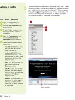
The RadioButton component lets you do something that the CheckBox
component cannot do: force a user to make a single choice within a set
of choices. The RadioButton component must be used in a group of at
least two RadioButton instances, and only one member of the group
can be selected at any given time. Selecting one radio button in a
group will deselect the currently selected radio button in the group. For
example, a radio button options for Gender can be Male, Female. There
can be only one answer to that question, so you would group the two
items using RadioButton components.
Adding a Radio
Button
Add a RadioButton Component
Open the Components panel.
Click the User Interface arrow to
expand the list.
Drag one or more RadioButton
components onto the Stage, and
then select one at time.
Open the Properties panel, and
then click the Component
Parameters arrow to expand it.
4
3
2
1
1
2
3
RadioButton component
Did You Know?
A visitor can control a radio button
selection with the keyboard.
Click the
Tab key until one of the buttons within
the group receives focus (is selected),
and then use the left and right arrow
keys to change the selection within the
group. Having the ability to use the
keyboard makes Flash components
compliant with the current rules on
accessibility as set by the U.S.
Congress.
From the Library of Wow! eBook
ptg
Chapter 18 Adding and Modifying Components
439
Select from the following
RadioButton parameters:
◆
data (2.0) or value (3.0). Click
the Value field, and then enter a
value that will be used to
populate the RadioButton.
◆
groupName. Click the Value
field, and then enter a group
name for the button. When you
associate a group name to
several RadioButton
components, the visitor will
only be able to select one
button in the group.
◆
label. Click the Value field, and
then enter a label for the
RadioButton.
◆
labelPlacement. Click the Value
field, and then select between
right, left, top, or bottom for the
placement of the label text.
◆
selected. When you select the
check box, the field appears
selected. If you deselect the
check box, the field appears
unselected.
◆
enabled (3.0). When you select
the check box, the items in the
list can be selected. If you
deselect the check box, the
field appears grayed out and is
not selectable.
◆
visible (3.0). When you select
the check box, the field can be
viewed. If you deselect the
check box, the field is invisible.
Click the Control menu, point to
Test Movie, and then click Test.
Since the RadioButton
components both use the same
Group name, you can only select
one button.
6
5
6
5
4
From the Library of Wow! eBook
ptg
440
Chapter 18
The TextArea component works with the ActionScript TextField object.
Once a TextArea component is added to the Stage, you can use styles
to customize font, size, and color. In addition, a TextArea component
can be formatted using HTML. If this sounds similar to the TextInput
component, you're right. In fact, the major difference between a
TextInput and a TextArea field is the ability of the TextArea field to gen-
erate multiple lines. TextArea fields can be used to hold information. For
example, you can use a TextArea component to create a comment or a
suggestion field on an interactive form.
Adding a Text Area
Add a TextArea Component
Open the Components panel.
Click the User Interface arrow to
expand the list.
Drag the TextArea component
onto the Stage, and then select the
component.
Open the Properties panel, and
then click the Component
Parameters arrow to expand it.
Select from the following TextArea
parameters:
◆
condenseWhite (3.0). When
you select the check box, it
removes extra white space
(spaces, line breaks) in a text
field. If you deselect the check
box, the white space remains.
◆
editable. When you select the
check box, the field can be
edited. If you deselect the
check box, the field can be
selected but not edited.
◆
html (2.0). When you select the
check box, it allows HTML to
control the formatting of the
data. If you deselect the check
box, the field cannot be
modified using HTML.
◆
text. Click the Value field, and
then enter the initial text that
will appear in the TextArea
component.
5
4
3
2
1
1
2
3
TextArea component
From the Library of Wow! eBook


