Thiết kế flash với flash cs5 part 73
Bạn đang xem bản rút gọn của tài liệu. Xem và tải ngay bản đầy đủ của tài liệu tại đây (912.32 KB, 6 trang )
ptg
448
Chapter 18
The DataGrid component allows you to create strong data-enabled dis-
plays and applications. You can use the DataGrid component to create
a recordset (retrieved from a database query in ColdFusion, Java, or
.Net) using Adobe Flash Remoting and display it in columns. You can
also use data from a data set or from an array to fill a DataGrid compo-
nent. The DataGrid component includes horizontal scrolling, event sup-
port (including event support for editable cells), sorting capabilities,
and performance optimizations. The data for a grid can come from a
recordset that is fed from a database query in Adobe ColdFusion, Java,
or .Net using Flash Remoting, a data set or an array. To pull the informa-
tion into a DataGrid, you set the DataGrid.dataProvider property to the
recordset, data set, or array.
Adding a Data Grid
Add a DataGrid Component
Open the Components panel.
Click the User Interface arrow to
expand the list.
Drag the DataGrid component onto
the Stage, and then select the
component.
Enter a unique instance name for
the DataGrid component in the
Property Inspector.
Select Frame 1 in the actions layer
in the Timeline.
Open the Actions panel, and then
enter the script as shown in the
illustration.
The Flash Remoting recordset
recordSetInstance is assigned to
the dataProvider property of
myDataGrid.
6
5
4
3
2
1
1
DataGrid
component
5
2 3
6
Did You Know?
You can resize or copy the DataGrid.
Select the Transform tool from the tool-
box, and then use the resize nodes to
change the width and height. To copy
the DataGrid, select the Selection tool,
hold down the Alt key (Win), Option key
(Mac), and then drag the component.
From the Library of Wow! eBook
ptg
Chapter 18 Adding and Modifying Components
449
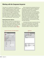
Modify DataGrid Options
Select the DataGrid component.
Open the Properties panel, and
then click the Component
Parameters arrow to expand it.
Select from the following DataGrid
parameters:
◆
editable. When you select the
check box, the field can be
edited. If you deselect the
check box, the field can be
selected but not edited.
◆
mutipleSelection (2.0) or
allowMultipleSelection (3.0).
When you select the check
box, the visitor can select more
than one item. If you deselect
the check box, the visitor can
only select a single item.
◆
headerHeight (3.0). Click the
Value field, and then enter a
header height.
◆
rowHeight. Click the Value
field, and then enter a number
to determine the spacing
between items in the list. The
higher the value, the more
space between items.
◆
horizontal or vertical
ScrollPolicy (3.0). Click the
Value field, and then select
auto, on, or off to show or hide
scroll bars.
◆
horizontal or vertical Line or
Page ScrollSize (3.0). Click the
Value field, and then enter a
number for the scroll size.
◆
resizableColumns (3.0). When
you select the check box,
columns are resizeable.
◆
showHeaders (3.0). When you
select the check box, headers
are displayed.
◆
sortableColumns (3.0). When
you select the check box,
columns are sortable.
3
2
1
Editable field
Multiple Selection field
3
2
From the Library of Wow! eBook
ptg
450
Chapter 18
Using a Local
Data Provider
Use a Local Data Provider
Open the Components panel.
Click the User Interface arrow to
expand the list.
Drag the DataGrid component onto
the Stage, and then select the
component.
Enter a unique instance name for
the DataGrid component in the
Property Inspector.
Select Frame 1 in the actions layer
in the Timeline.
Open the Actions panel, and then
enter the script as shown in the
illustration.
Click the Control menu, point to
Test Movie, and then click Test.
The name and home fields are the
column headings for the DataGrid
component, and the values fill the
cells in each row.
7
6
5
4
3
2
1
The DataGrid component lets you provide data using a local (embedded
in the document) data provider. The data is read into the grid from a
pre-written ActionScript, and since Flash components are on the Stage,
the ActionScript would typically be entered into the first frame of the
Flash Timeline. It's smart programming to create a separate layer to
hold the ActionScript for the DataGrid. That way you have much easier
access to the script.
1
DataGrid
component
5
32
Did You Know?
You can use a Data Provider.
Data
Provider, such as adding data within an
ActionScript, makes the Flash docu-
ment display the same data every time
the Flash document is displayed. You
can always modify the data as the
movie plays, by adding additional
ActionScript instructions on the
Timeline, and therefore, create a more
dynamic Data Provider.
6
From the Library of Wow! eBook
ptg
Chapter 18 Adding and Modifying Components
451
1
Loader component
4
2
3
Adding a Loader
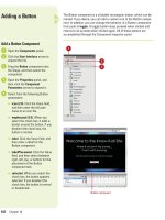
Add a Loader Component
Open the Components panel.
Click the User Interface arrow to
expand the list.
Drag the Loader (2.0) or UILoader
(3.0) component onto the Stage,
and then select the component.
Select the Free Transform tool to
size the Loader to the dimensions
of the image file.
Open the Properties panel, and
then click the Component
Parameters arrow to expand it.
Enter the path to the JPG or SWF
file in the contentPath value (2.0)
or source (3.0) field.
Click the Control menu, point to
Test Movie, and then click Test.
Flash displays the selected image
in the Loader component.
7
6
5
4
3
2
1
5
4
The Loader component is a container that can display a .swf or a .jpg.
You use the Loader component when you want to pull in external con-
tent into a Flash movie. For example, you can bring in a product intro-
duction (.swf) or a company logo (.jpg) at the beginning of a movie. In
addition, you can scale the contents of the loader, or resize the loader
itself, to accommodate the size of the contents. By default, the contents
are scaled to fit.
From the Library of Wow! eBook
ptg
452
Chapter 18
The NumericStepper component allows a user to step through an
ordered set of numbers. The component consists of a number displayed
beside small up and down arrow buttons. You can decide the maximum
and minimum values along with the step value. When the visitor clicks
the up or down buttons, the value changes until the maximum or mini-
mums are reached. As its name implies, the numeric stepper compo-
nent only handles numbers, text or special characters are not allowed.
The NumericStepper component has many uses; for example, a site
that books rooms for a major hotel chain would use a stepper for letting
the visitor indicate how many people are staying, or an airline for how
many people are flying.
Adding a Numeric
Stepper
Add a NumericStepper
Component
Open the Components panel.
Click the User Interface arrow to
expand the list.
Drag the NumericStepper
component onto the Stage, and
then select the component.
Open the Properties panel, and
then click the Component
Parameters arrow to expand it.
IMPORTANT
The
NumericStepper component can
be used to change the properties
of items on the stage. You could
link a NumericStepper instance to
the property value of a dynamic
text box, and then use the stepper
to change the size of the text. This
can be useful for people who
require larger, readable text.
4
3
2
1
1
2
3
NumericStepper component
From the Library of Wow! eBook


