Thiết kế flash với flash cs5 part 74
Bạn đang xem bản rút gọn của tài liệu. Xem và tải ngay bản đầy đủ của tài liệu tại đây (903.52 KB, 6 trang )
ptg
454
Chapter 18
Adding a Progress
Bar
Add a ProgressBar Component
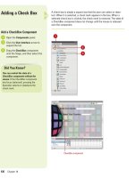
Open the Components panel.
Click the User Interface arrow to
expand the list.
Drag the ProgressBar component
onto the Stage, and then select the
bar.
Give the ProgressBar component a
unique instance name in the
Property Inspector.
Open the Properties panel, and
then click the Component
Parameters arrow to expand it.
Click the Mode list arrow, and then
click Event.
6
5
4
3
2
1
4
ProgressBar component
Did You Know?
The ProgressBar component doesn’t
make a good preloader.
A preloader is
a custom progress bar that shows the
loading status of an entire movie, and
is usually smaller in file size than the
ProgressBar component.
The loading process can be determi-
nate or indeterminate.
A determinate
progress bar is linear, tracking
progress over time. Use this when the
amount of content is known.
Indeterminate progress bar is used
when the amount of content is
unknown.
The ProgressBar component is a necessity for Flash documents that
require a long time to download, because they display the loading
progress while a user waits. Web designers live under what is called
the "ten-second rule." What that implies is that visitors to your Web site
have very little patience, and they want to see things happening. When
you add a ProgressBar component, the visitor sees a moving represen-
tation (a bar), letting them know the information is being downloaded.
1
2
3
6
5
From the Library of Wow! eBook
ptg
Chapter 18 Adding and Modifying Components
455
Drag a Loader component from the
Components panel onto the Stage.
Give the Loader component a
unique instance name in the
Property Inspector.
Select the ProgressBar
component.
Open the Properties panel, and
then click the Component
Parameters arrow to expand it,
and then enter the instance name
of the Loader into the Source
value field.
Select Frame 1 in the actions layer
in the Timeline.
Open the Actions panel, and then
enter the script as shown in the
illustration that will load a .jpg, or
.swf file into the Loader
component.
When executed, the ProgressBar
component will display a
horizontal bar, and the percentage
of the file that's loaded.
Click the Control menu, point to
Test Movie, and then click Test.
When executed, the ProgressBar
component will display a moving
horizontal bar, and a percentage
which displays how much of the
file has loaded.
IMPORTANT
Notice that
you're not adding scripts to the
components on the Stage. The key
is that these components are
activated by scripts in Frame 1 on
the Timeline, and are identified by
using unique instance names for
each component.
13
12
11
10
9
8
7
7
9
12
10
From the Library of Wow! eBook
ptg
456
Chapter 18
The ScrollPane component can be used for displaying large movie
clips, .jpg files, and .swf files that need a scrollable area to display, or
that you want to confine to a specific area on the Flash Stage. You have
the ability to display images in a limited area, using scroll bars, and the
content loaded into the ScrollPane can be from a local location, or over
the Internet.
Adding a Scroll Pane
Add a ScrollPane Component
Open the Components panel.
Click the User Interface arrow to
expand the list.
Drag the ScrollPane component
onto the Stage, and then select the
pane.
Open the Properties panel, and
then click the Component
Parameters arrow to expand it.
Select from the following
ScrollPane parameters:
◆
contentPath (2.0) or source (3.0).
Click the Value field, and then
enter the full path name to the
movie clip, .jpg, or .swf file.
◆
hLineScrollSize (2.0) or
horizontalLineScrollSize (3.0).
Click the Value field, and then
enter the number of pixels to
move the content when the left
or right arrow in the horizontal
scroll bar is pressed.
◆
hPageScrollSize (2.0) or
horizontalPageScrollSize (3.0).
Click the Value field, and then
enter the number of pixels to
move the content when the
track in the horizontal scroll bar
is pressed.
◆
hScrollPolicy (2.0) or
horizontalScrollPolicy (3.0).
Click the Value field, and then
select whether the horizontal
scroll bar is always present (on),
never present (off), or appears
automatically according to the
image size (auto).
5
4
3
2
1
1
2
3
ScrollPane component
From the Library of Wow! eBook
ptg
Chapter 18 Adding and Modifying Components
457
◆
scrollDrag. Click the Value
field, and then select whether
there is scrolling when a user
presses and drags within the
ScrollPane (true), or no
scrolling (false).
◆
vLineScrollSize (2.0) or
verticalLineScrollSize (3.0).
Click the Value field, and then
enter the number of pixels to
move the content when the up
or down arrow in the vertical
scroll bar is pressed.
◆
vPageScrollSize or
verticalPageScrollSize (3.0).
Click the Value field, and then
enter the number of pixels to
move the content when the
track in the vertical scroll bar is
pressed.
◆
vScrollPolicy (2.0) or
verticalScrollPolicy (3.0). Click
the Value field, and then select
whether the vertical scroll bar
is always present (on), never
present (off), or appears
automatically according to the
size of the image (auto).
◆
enabled. When you select the
check box, the field can be
selected. If you deselect the
check box, the field appears
grayed out and is not
selectable.
◆
visible. When you select the
the check box, the field can be
viewed. If you deselect the
check box, the field is invisible.
◆
minHeight (2.0). Click the Value
field, and then enter a minimum
height for the ScrollPane.
◆
minWidth (2.0). Click the Value
field, and then enter a minimum
width for the ScrollPane.
Click the Control menu, point to
Test Movie, and then click Test.
6
6
5
4
From the Library of Wow! eBook
ptg
458
Chapter 18
Data binding is a simple way of connecting Flash components to each
other. Components can be viewed as containers that transfer informa-
tion (images, text, numbers, video, graphics) from one to the other. In the
Component Inspector panel, the Bindings tab controls the two contain-
ers, so that when property X of component A changes, it will copy the
new value to property Y of component B. You can do data binding within
the Component Inspector panel using the Bindings tab. The Bindings tab
lets you add, view, and remove bindings for the selected component.
Although data binding works with any component, its main purpose is to
connect Component panel UI components to external data sources.
These external data sources are available as components with proper-
ties, which you can bind to other component properties. The Component
Inspector panel is the main tool that is used within Flash for data bind-
ing. It contains a Schema tab for defining the schema for a component
and a Bindings tab for creating bindings between component properties.
The following example demonstrates how to create basic data binding
by connecting one UI component to another.
Creating Bindings
Create Bindings
Open the Components panel.
Click the User Interface arrow to
expand the list.
Drag the NumericStepper
component onto the Stage, and
then select the component.
Give the NumericStepper a unique
instance name in the Property
Inspector.
Drag a second NumericStepper
onto the Stage, and then give it a
unique instance name.
Select the first NumericStepper
component.
6
5
4
3
2
1
4
5
3
From the Library of Wow! eBook


