ADOBE ILLUSTRATOR CS2 REVEALED PHẦN 09 pps
Bạn đang xem bản rút gọn của tài liệu. Xem và tải ngay bản đầy đủ của tài liệu tại đây (2.51 MB, 51 trang )
Lesson 4 Map Artwork to 3D Objects
ILLUSTRATOR 11-39
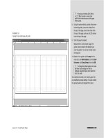
Art dialog box, shown in Figure 70, you
must first choose which surface you intend
to map the art to. When you click the sur-
face buttons, the active surface is shown in
red wireframe on the 3D object. In this
example, we are mapping the wrapping
paper to surface 1 of 4, which is shown in
Figure 71.
The grid pattern represents the complete
surface of surface 1 of 4. Understand that
this means not only the surface that you
see—the front surface—but the entire
surface, all the way around. For this exercise,
we’re interested in mapping the wrapping
paper to the surface that we can see—the
front surface. That area is defined by the
curved lines, identified in Figure 71.
FIGURE 70
Map Art dialog box
FIGURE 71
Identifying the surface to be mapped
Last surface
button
Previous
surface
button
First
surface
button
Next
surface
button
Interior of curved
lines represents
visible surface
(1 of 4)
ILLUSTRATOR 11-40
Creating 3D Objects
Once you have chosen the surface, you
then choose the symbol to be mapped by
clicking the Symbol list arrow and select-
ing the appropriate symbol. When you do
so, the symbol artwork is centered on the
grid. In this example, the symbol is named
Wrapping Paper. For this exercise, we drag
the artwork so that it completely covers the
curved lines that represent the front face,
as shown in Figure 72.
Once the artwork is mapped, it reshapes
itself to the three-dimensional object, as
shown Figure 73.
FIGURE 72
Positioning the symbol artwork
FIGURE 73
Viewing the mapped art
Wrapping Paper
symbol selected
Lesson 4 Map Artwork to 3D Objects
ILLUSTRATOR 11-41
Prepare a document for
mapped artwork
1. Open AI 11-7.ai, then save it as Tea Can.
2. Select all, click Effect on the menu bar, point
to 3D, click Revolve, then click OK.
Your artwork should resemble Figure 74.
3. Open AI 11-8.ai, select all, click Edit on the
menu bar, click Copy, close the document,
then return to Tea Can.ai.
4. Click Window on the menu bar, click
Symbols, click Edit on the menu bar, click
Paste, then drag the pasted artwork into the
Symbols palette to create a new symbol.
5. Delete the pasted artwork from the artboard.
6. Double-click the new symbol in the Symbols
palette, type Elephant Rectangle in the
Symbol Options dialog box, then click OK.
7. Open AI 11-9.ai, select all, copy the artwork,
close the document, return to Tea Can.ai,
then paste the artwork.
8. Drag the pasted artwork into the Symbols
palette to create a new symbol, then delete
the pasted artwork from the artboard.
9. Name the new symbol Elephant Circle.
You used the 3D Revolve effect to create the
artwork to which the 2D artwork will be mapped.
You then created two symbols, one for each part
of the 2D artwork.
FIGURE 74
Creating the “tea can” and “lid”
ILLUSTRATOR 11-42
Creating 3D Objects
Map rectangular artwork
1. Click the Selection Tool , click the silver-
object, then press eight times so that the
silver artwork is fully “under” the purple lid.
2. Double-click 3D Revolve in the Appearance
palette to open the 3D Revolve Options dia-
log box, click the Preview check box, then
click Map Art.
3. Note that the Surface text box reads 1 of 3
and that a red line indicates that surface on
the object, as shown in Figure 75.
4. Click the Next Surface button two times,
so that the Surface text box reads 3 of 3.
The light gray areas of the layout grid repre-
sent the visible area of the silver object at
this viewing angle.
5. Click the Symbol list arrow, then click
Elephant Rectangle.
6. Drag the top-left and bottom-right resizing
handles on the symbol’s bounding box so
that the artwork fits into the light gray areas
of the layout grid, as shown in Figure 76.
(continued)
FIGURE 75
Viewing surface 1 of 3 in the Map Art dialog box
FIGURE 76
Resizing the artwork to the visible area
Surface 1 of 3
Red line identifies
surface
Resizing
handles
Lesson 4 Map Artwork to 3D Objects
ILLUSTRATOR 11-43
7. Drag the bottom-middle resizing handle up
slightly so that the silver “can” will show
beneath the “elephant label.”
8. Click the Shade Artwork (slower) check box.
9. Click OK, change the ambient light setting to
65%, change the highlight intensity setting
to 80%, change the number of blend steps
to 128, then move the light to the location
shown in Figure 77.
10.Click OK, deselect all, then compare your
work to Figure 78.
In the Map Art dialog box, you selected the
symbol that you wanted to map and the surface
that you wanted to map it to. You resized the
symbol artwork so that it fit onto the surface
properly, then you activated the shading option to
make the artwork appear more realistic as a label.
You modified surface shading settings and lighting
to improve the appearance of the artwork.
FIGURE 77
Adjusting surface shading and lighting
FIGURE 78
Viewing the mapped art
Light source
ILLUSTRATOR 11-44
Creating 3D Objects
Map round artwork
1. Click the purple “cover” object, double-
click 3D Revolve in the Appearance
palette, click the Preview check box,
then click Map Art.
2. Click the Next Surface button once, so
that the Surface text box reads 2 of 5.
3. Click the Symbol list arrow, then click
Elephant Circle.
4. Point to the upper-right resizing handle
until a rotate cursor appears, then drag to
rotate the graphic to the position shown in
Figure 79.
5. Click OK to close the Map Art dialog box,
click OK again, deselect all, then compare
your artwork to Figure 80.
You mapped a circular piece of 2D artwork to an
oval 3D object.
FIGURE 79
Rotating the mapped art
FIGURE 80
Viewing the mapped art
Rotate cursor
Lesson 4 Map Artwork to 3D Objects
ILLUSTRATOR 11-45
Map texture artwork
1. Open AI 11-10.ai, select all, copy the artwork,
close the document, then return to Tea Can.ai.
2. Verify that the Symbols palette is visible,
click Edit on the menu bar, click Paste, then
drag the pasted artwork into the Symbols
palette to create a new symbol.
3. Delete the pasted artwork from the artboard.
4. Double-click the new symbol in the Symbols
palette, type Cover Texture, then click OK.
5. Click the purple “cover” object, double-click
3D Revolve (Mapped) in the Appearance
palette, click the Preview check box, then
click Map Art.
6. Click the Next Surface button until the
Surface text box reads 5 of 5.
7. Click the Symbol list arrow, then click Cover
Texture.
8. Position the symbol artwork so that it
covers the entire light gray area, shown in
Figure 81.
9. Click OK to close the Map Art window, then
drag the light to the location shown in
Figure 82.
10.Click OK, deselect all, then compare your
work to Figure 83.
11.Save your work, then close Tea Can.
You mapped artwork to the front face of a 3D
object to add texture.
FIGURE 81
Positioning the artwork
FIGURE 82
Relocating the light
FIGURE 83
Viewing the finished artwork
CHAPTER SUMMARY
The key to creating 3-dimensional
artwork is to understand the X, Y, and Z
axes and be able to identify them on your
illustrations. Then you can let the power
of CS2’s 3D features do the work for you.
By extending an object’s Z axis, you add
three dimension to it. The 3D Extrude &
Bevel Options dialog box allows you
to add more detail to your object by
choosing a bevel shape, adjusting the
depth of extrusion, choosing a type of
surface shading and manipulating light
sources. You can also further adjust the
X, Y, and Z rotations while previewing
the changes you make. Revolving
artwork is another way to create 3D art.
Revolving artwork sweeps a path in a
circular direction around the Y axis.
Finally, mapping artwork is a way to
“wrap” your illustrations around an
object or shape. The Map Art button in
the 3D Extrude & Bevel Options dialog
box offers you a variety of ways to map
your art to an object so that your
artwork looks as if it’s wrapped around
a 3D shape. Take time to experiment
with the features in this chapter. You’ll
be impressed with your results.
What You Have Learned
• How to extrude an object
• How to extrude and rotate an object
• How to extrude a compound path
• How to apply a bevel shape to an
object’s edge
• Revolve an object
• Revolve multiple objects
• Revolve grouped objects
• Offset a revolved object
• Apply surface shading to a 3D object
• Manipulate lighting controls
• Manipulate light sources
• Prepare a document for mapped
artwork
• Map rectangular artwork
• Map round artwork
• Map texture artwork
Key Terms
Two-dimensional object An object
that has two axes: an X axis representing
the width and a Y axis representing the
height.
Extrude To add depth to an object by
extending it on its Z axis. An object’s
Z axis is always perpendicular to the
object’s front surface.
Bevel The bevel is the angle that one
surface makes with another when they
are not at right angles.
Revolving Revolving an object
“sweeps” a path in a circular direction
around the Y axis.
Surface shading Surface shading
controls how the object’s surface appears.
When an object is revolved, four surface
shadings are available: Wireframe,
No Shading, Diffuse Shading, and Plastic
Shading.
Highlight Intensity Highlight
Intensity controls how intense a high-
light appears.
ILLUSTRATOR 11-46
Creating 3D Objects
12-1
PREPARING A DOCUMENT
FOR PREPRESS
AND PRINTING
12
chapter
1. Explore basic color theory.
2. Work in CMYK mode.
3. Specify spot colors.
4. Create crop marks.
5. Create bleeds.
12-2
Illustrator is so widely praised for its excel-
lence as a drawing tool, it’s easy to forget
that the application is also a top-notch
page layout solution. Illustrator CS2 is a
powerhouse print production utility, a
state-of-the-art interface with the world of
professional prepress and printing.
Everything that you need to produce an
output-ready document is there—crop
marks, trim marks, reliable process tints,
the full PANTONE library of non-process
inks—all backed by a sophisticated color
separations utility. If you are new to the
world of prepress and printing, Illustrator
CS2 makes for an excellent training
ground, with straightforward, easy-to-use
palettes and dialog boxes. If you are experi-
enced, you will admire how Illustrator
seamlessly transitions from design and
drawing to layout and output, thoughtfully
and thoroughly encompassing the gamut
of a printer’s needs, demands, and wishes.
PREPARING A DOCUMENT
FOR PREPRESS
AND PRINTING
chapter
12
12-3
Tools You’ll Use
EXPLORE BASIC
LESSON 1
Exploring Basic Color Theory
All of the natural light in our world
comes from the sun. The sun delivers
light to us in waves. The entirety of the
sun’s light, the electromagnetic spec-
trum, contains an infinite number of
light waves—some at high frequencies,
some at low frequencies—many of which
will sound familiar to you. X-rays, gamma
rays, and ultraviolet rays are all compo-
nents of the electromagnetic spectrum.
The light waves that we see in our world are
only a subset of the electromagnetic spec-
trum. Scientists refer to this subset—this
range of wavelengths—as visible light.
Because this light appears to us as colorless
(as opposed to, say, the red world of the
planet Mars), we refer to visible light as
“white light.”
From your school days, you may remem-
ber using a prism to bend light waves to
reveal what you probably referred to as a
rainbow. It is through this bending, or
“breaking down” of white light, that we see
color. The rainbow that we are all so famil-
iar with is called the visible spectrum, and
it is composed of seven distinct colors: red,
orange, yellow, green, blue, indigo, and
What You’ll Do
In this lesson, you will learn basic color
theory to gain an understanding of the role
of CMYK ink in offset printing.
▼
ILLUSTRATOR 12-4
Preparing a Document for Prepress and Printing
COLOR THEORY
Lesson 1 Explore Basic Color Theory
ILLUSTRATOR 12-5
violet. Though the colors are distinct, the
color range of the visible spectrum is infi-
nite; for example, there’s no definable place
in the spectrum where orange light ends
and yellow light begins.
Colors in the visible spectrum can them-
selves be broken down. For example,
because red light and green light, when
combined, produce yellow light, yellow
light can, conversely, be broken down, or
reduced, to those component colors.
Red, green, and blue light (RGB) are the
additive primary colors of light, as shown
in Figure1. The term primary refers to the
fact that red, green, and blue light cannot
themselves be broken down or reduced.
The term additive refers to the fact that
these same colors combine to produce
other colors. For example, red and blue
light, when combined, produce violet hues.
As primary colors, red, green, and blue
light are the irreducible component colors
of white light. Therefore, it logically follows
that when red, green, and blue light are
combined equally, they produce white light.
Finally, you’ll note that nowhere in this
paradigm is the color black. That is
because, in the natural world, there is no
such color as black. True black is the
absence of all light.
FIGURE 1
Red, green, and blue are the additive primary colors of light
White light
ILLUSTRATOR 12-6
Preparing a Document for Prepress and Printing
Understanding Subtractive
Primary Colors
Three things can happen when light strikes
an object: the light can be reflected,
absorbed, or transmitted, as shown in
Figure 2.
Reflection occurs when light strikes an
object and “bounces” off the object. Any
object that reflects all of the light that
strikes it appears as pure white.
Absorption occurs when light strikes an
object and is not reflected, but instead is
absorbed by the object. Any object that
absorbs all of the light that strikes it
appears as pure black.
Transmission occurs when light strikes an
object and passes through the object. Any
object that transmits all of the light that
strikes it becomes invisible.
There are no truly invisible objects in our
world (only some gasses are invisible).
Nor are there any purely white or purely
black objects. Instead, depending on the
physical properties of the object, varying
amounts of light are reflected, absorbed,
and transmitted.
If an object absorbs some light, it logically
follows that not all the white light that strikes
the object will be reflected. Put another way,
red, green, and blue light will not be reflected
in full and equal amounts. What we perceive
as the object’s color is based on the percent-
ages of the red, green, and blue light that are
reflected and the color that that combination
of light produces.
An object appears as cyan if it absorbs all of
the red light that strikes it and also reflects
or transmits all of the green and all of the
blue light. An object that absorbs all of the
green light that strikes it and also reflects
or transmits all of the red and all of the
blue light appears as magenta. An object
that absorbs all of the blue light that
strikes it and also reflects or transmits all
of the red and all of the green light appears
as yellow, as shown in Figure 3.
Cyan, magenta, and yellow are called sub-
tractive primary colors. The term sub-
tractive refers to the fact that each is
produced by removing or subtracting one of
the additive primary colors, and overlapping
all three pigments would absorb all colors.
QUICKTIP
You may be thinking back to your school days and remem-
bering that red, blue, and yellow are primary colors. They
are. Red, blue, and yellow are the primary colors for mixing
opaque (nontransmissive) paint, but that is entirely extrane-
ous to the concepts covered in this chapter.
FIGURE 2
Visual representations of reflection, absorption, and transmission
FIGURE 3
Printers often refer to cyan as “minus red,” magenta as “minus green,” and yellow as “minus blue”
Lesson 1 Explore Basic Color Theory
ILLUSTRATOR 12-7
Understanding the Theory of
Four-Color Process Printing
Color printing uses the three subtractive
primary colors (plus black) to produce a
color image or tint. To understand this,
read the two points below carefully:
■ The standard color for paper is white.
The paper appears as white because it
is manufactured to reflect RGB light in
equal amounts.
■ Cyan, magenta, and yellow inks are
transparent—they are manufactured so
that light passes through them. For
example, cyan ink is manufactured to
absorb red light and transmit green and
blue light.
Here is the key to the whole theory: The
color that you see when you look at a
printed page is not reflected off the inks; it is
light reflected off the paper. The light that is
reflected off the paper is that which has not
been absorbed (or subtracted) by the inks.
Figure 4 demonsrates this concept.
FIGURE 4
The color of the printed image is reflected off the paper, not the inks
Creating a rich black
For many designers, black is the most powerful “color” in the palette. No other color
can provide such contrast. Black can be used to trigger emotions. Black is neutral, but
it’s never silent. Use black ink (K) for text and lines and small areas of your artwork.
When you have designed artwork with large black areas that you want to be dramati-
cally black, keep in mind that black ink alone may not be enough to produce the effect.
To produce deep blacks, printers create a process tint that is 100% K plus 50% C. The
cyan ink overlapped with the black produces a dark, rich black . . . which is why print-
ers refer to this tint as a “rich black.” Keep the idea in mind when you are working with
black, but remember also that rich blacks are never used for text or lines.
ILLUSTRATOR 12-8
Preparing a Document for Prepress and Printing
Understanding CMYK Inks
CMYK inks are called process inks. Process
inks are manufactured by people, so by defi-
nition, they’re not perfect. For example, no
cyan ink can be manufactured so that it
absorbs 100% of the red light that strikes it.
Some is reflected, and some is transmitted,
as shown in Figure 5. Perfect magenta and
yellow inks cannot be manufactured either.
In addition, an ink’s ability to transmit light
is not perfect. That same cyan ink should, if
it were a true cyan, transmit both blue and
green light. Manufactured cyan inks actu-
ally absorb a small percentage of blue and
green light.
These imperfections become crucial when
you try to use cyan, magenta, and yellow
(CMY) to print dark areas of an image. In
theory, if you overlapped all three inks, the
area would appear black because each
would absorb an additive primary, and no
light would be reflected off the paper, as
shown in Figure 6.
FIGURE 5
Cyan ink in theory vs. reality
FIGURE 6
If "perfect" inks were overlapped, no light would be reflected; the area of the overlap would appear black
Lesson 1 Explore Basic Color Theory
ILLUSTRATOR 12-9
FIGURE 7
In reality, CMY inks are insufficient to produce black areas
Because, in reality, the inks are unable to
achieve 100% absorption and some light
gets through and is reflected off the paper,
CMY inks are unable to produce satisfac-
tory shadows and dark areas of an image, as
shown in Figure 7.
To compensate, black ink is used to pro-
duce deep shadows and fine detail. Printers
refer to black ink as “K.” They do not refer
to it as “B” because “B” could be confused
with blue, and blue could be confused with
cyan. Also, printers have long referred to
black as the “key” for aligning (registering)
the four colors. Thus, the K in CMYK,
though not a subtractive primary, is never-
theless essential to the subtractive printing
process, as shown in Figure 8.
FIGURE 8
The image on the left was printed with only CMY inks; black ink adds contrast and depth to the image on the right
Coping with color confusion
If all of this color theory talk is making your head spin, don’t worry about it. Working
in Illustrator and producing a printed project does not require that you have these
theories in your head. As you become more experienced with the printing process
(and if you generally like this kind of stuff), these concepts will make more sense.
Until then, remember the two essential points of this discussion: The offset printing
process uses transparent CMYK inks; the color you see on a printed page is reflected
off the paper, not the inks.
WORK IN
LESSON 2
Understanding Color Gamut
RGB, CMYK, and HSB are all known as
color models. The color mode deter-
mines the color model used to display and
print Illustrator documents. Illustrator
offers two color modes for documents:
RGB and CMYK.
As we’ve discussed, offset color printing is
based on the CMYK color model. All light-
emitting devices, such as your television
or your monitor, produce color based on
the RGB color model. If you flick a drop of
water at your television screen, you will be
able to see that the image is composed of
very small red, green, and blue pixels. The
full range of color that you perceive when
you watch TV is the result of the additive
properties of light; the red, green, and blue
light are combining to produce the image.
Color gamut refers to the range of colors
that can be printed or displayed by a
given color model. A good monitor, based
on the RGB color model, can produce a
color gamut of more than 16 million
colors. However, the spectrum of colors
that can be viewed by the human eye is
wider than any man-made method for
reproducing color.
What You’ll Do
In this lesson, you will use Illustrator’s
Color Picker, Color palette, and print
options in CMYK Color mode.
▼
ILLUSTRATOR 12-10
Preparing a Document for Prepress and Printing
Setting up color management
For the print and prepress professional, Illustrator’s Color Settings dialog box simpli-
fies the goal of setting up a color-managed workflow by bringing most of the standard
color management controls to a single place. The predefined configurations offer a set
of color management options that are designed to achieve color consistency in a pro-
duction workflow. In most cases, the predefined color settings will provide enough
color management controls to meet the demands of a prepress environment.
CMYK MODE
Lesson 2 Work in CMYK Mode
ILLUSTRATOR 12-11
The CMYK color model is substantially
smaller than the RGB color model.
Therefore, when you are creating computer
graphics, remember that some colors that
you can see on your monitor cannot be
reproduced by the CMYK printing process.
Illustrator addresses this reality in different
ways. For example, if you are working in
RGB mode and choosing colors in the
Color Picker or the Color palette,
Illustrator will warn you if you have chosen
a color that is “out-of-gamut”—that is, a
color that cannot be printed. Also, if you
have created an image in RGB mode and
you convert to CMYK mode, Illustrator will
automatically replace the out-of-gamut col-
ors applied to images with their closest
CMYK counterparts.
As shown in Figure 9, the colors in RGB
that are out-of-gamut for the CMYK color
model are the brightest, most saturated,
and most vibrant hues.
Don’t despair. As you have certainly noted
from looking at art books, posters, and
even some high-quality magazines, the
CMYK color model can be used to repro-
duce stunning color images. (Note:
Because this book is a printed product and
therefore based on the CMYK color model,
we are unable to show you examples of out-
of-gamut colors.)
FIGURE 9
CMYK color model is unable to reproduce the brightest and most saturated hues that you can see on your screen
This color is out-of-gamut
Out-of-gamut
warning icon
ILLUSTRATOR 12-12
Preparing a Document for Prepress and Printing
Specifying CMYK Tints
Tints are, quite simply, colors that you
print by mixing varying percentages of
CMYK inks. The lightest colors are pro-
duced with small percentages of ink, and
darker colors with higher percentages. You
can purchase process tint books that show
you—with a high degree of fidelity—a
large number of the color combinations
available in the CMYK gamut.
In Illustrator, you specify CMYK tints by
entering percentages in the Color Picker and
the Color palette, as shown in Figure 10.
If this idea is setting off alarms in your
head . . . good for you! All the color pro-
duced by your monitor is based on the RGB
color model. By definition, you cannot “see”
the CMYK color model (or real CMYK tints,
for that matter) on your monitor.
In the early days of desktop publishing, this
contradiction generated enormous fear in
the hearts of print professionals and created
an entire cottage industry of color calibra-
tion hardware and software. Despite the dire
FIGURE 10
Specifying a process tint in the Color palette
Dragging sliders in the
Color palette is referred
to as "specifying" or
"mixing" a color
Lesson 2 Work in CMYK Mode
ILLUSTRATOR 12-13
Printing transparent artwork
Whenever you have a document with transparent objects (objects whose opacity is set
to less than 100%), you should be sure to check the transparency preferences before
printing the file. When you print or save artwork that contains transparency,
Illustrator performs a process called flattening. When flattening, Illustrator identifies
transparent artwork, then isolates the areas that are overlapped by the transparent
object by dividing the areas into components. Illustrator then analyzes those compo-
nents to determine if they can be output with vector data or if they must be raster-
ized (converted to pixels). The flattening process works very well in most cases.
However, if you are unsatisfied with the appearance of the high-resolution output,
you may want to step in and rasterize the artwork yourself. Before outputting the file,
you can use Illustrator’s Overprint Preview mode (found on the View menu), which
approximates how transparency and blending will appear in color-separated output.
warnings, however, color calibration prob-
lems turned out to be a phantom menace;
simply put, the majority of print work pro-
duced is not so color-critical that variation
in color is a problem (if the variation is even
noticed).
Practically speaking, you must accept that
the colors in your illustration on-screen will
never be an exact match to the printed
version. However, the numbers that you
enter when specifying percentages of CMYK
are exactly the percentages that will be
output when the illustration goes to the
printer. Therefore, if you must have a spe-
cific tint, find the color in a process tint
book, and enter the percentages as specified.
Then, don’t worry about how the tint looks
on your screen. If it looks close, that’s
great. If not, it doesn’t matter. The printer
is contractually responsible to be able to
reproduce the tint that you specified.
ILLUSTRATOR 12-14
Preparing a Document for Prepress and Printing
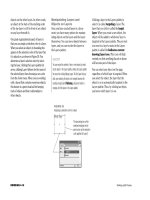
Specify process tints in the
Color Picker
1. Open AI 12-1.ai, then save it as Oahu.
2. Select the placed image, then hide it.
3. Double-click the Fill or Stroke button in the
toolbox to open the Color Picker, then type
189 for the hue, 100 for the saturation, and
100 for the brightness.
The out-of-gamut warning icon appears, as
shown in Figure 11.
4. Click the blue square under the out-of-
gamut warning icon.
The closest process color is specified as the
new fill color.
5. Click OK to close the Color Picker
dialog box.
6. Add the new color to the Swatches palette,
then name it Maverick.
You chose a color in the Color Picker that was
out-of-gamut for CMYK. You chose the process
match that the out-of-gamut warning offered as
a new fill color, then added it to the Swatches
palette.
FIGURE 11
Out-of-gamut warning in the Color Picker
Out-of-gamut
warning icon
Blue square
Using Type 1, TrueType and OpenType fonts
Type 1, TrueType and OpenType fonts are outline fonts used in both Macintosh and
Windows operating systems. TrueType and Type 1 fonts offer great quality and are easy
to use; however, they are incompatible on Macintosh and Windows platforms. For exam-
ple, a Macintosh TrueType font is different from a Windows TrueType font and they are
not cross-platform compatible. Adobe and Microsoft came up with OpenType fonts as the
solution to font sharing. OpenType fonts use a single font file for Macintosh and
Windows computers. This eliminates font substitution and text reflow problems. To
make sure your fonts are compatible on both systems, open your Illustrator document
on both a Macintosh and a Windows computer before you output the file.
Lesson 2 Work in CMYK Mode
ILLUSTRATOR 12-15
Mix process tints in the
Color palette
1. Click Window on the menu bar, then click
Color to show the Color palette, if necessary.
2. Click the Color palette list arrow, then click
CMYK, if necessary.
3. Using the sliders on the palette, mix a
process tint that is 5C/70M/100Y, then
press [Enter] (Win) or [return] (Mac).
In standard notation for process tints, zero
is not specified. As there is no black in this
tint, the K percentage is not noted.
TIP You will not see the new color in the
Color palette if the cursor is still flashing
in the last text box that you entered a new
value in. Pressing [Tab] advances your
cursor to the next text box.
4. Add the new color to the Swatches palette,
then name it Living.
5. Mix a new process tint that is 5C/40M/5Y.
6. Add the new color to the Swatches palette,
then name it Amazing.
7. Mix a new process tint that is 30M/100Y.
8. Add the new color to the Swatches palette,
then name it Twist.
9. Apply the four new tints that you have added
to the Swatches palette to the artwork, as
shown in Figure 12.
10.Save your work.
You mixed three different process tints in the
Color palette, saved them in the Swatches palette,
then applied the four tints you have created so far
in this chapter to the artwork.
FIGURE 12
Applying process tints to the artwork