css web sites with dreamweaver mx 2004 - Phần 7 potx
Bạn đang xem bản rút gọn của tài liệu. Xem và tải ngay bản đầy đủ của tài liệu tại đây (1.25 MB, 22 trang )
happening, you need to explicitly clear the floated element. The least troublesome way to
do this is to add an empty div before the element that you wish to remain clear of the
floated element. The div should have a class applied to it. The CSS class is simply:
.clear {
clear: both;
}
So the mark-up would look like:
<p class="imageleft"><img src="didling_church_thumb.jpg" alt="Didling
church" width="200" height="150" /></p>
<p>Lorem ipsum dolor sit amet, consectetuer adipiscing elit. Pellentesque
habitant morbi tristique senectus et netus et malesuada fames ac turpis
egestas. Sed pulvinar faucibus eros. Mauris et pede eu massa dictum
eleifend. Nulla in tortor eget nunc condimentum ornare. Praesent sed
augue. Vestibulum wisi ante, consectetuer at, scelerisque pellentesque,
semper vel, libero. Curabitur turpis sem, scelerisque a, varius eu,
feugiat sed, neque. Cras id urna. Mauris rhoncus sapien non tellus.
Nullam dapibus, nisl at congue auctor, tortor magna mollis metus, id
aliquet mi turpis a justo. </p>
<div class="clear"></div>
<p>Lorem ipsum dolor sit amet, consectetuer adipiscing elit. Pellentesque
habitant morbi tristique senectus et netus et malesuada fames ac turpis
egestas. Sed pulvinar faucibus eros. Mauris et pede eu massa dictum
eleifend. Nulla in tortor eget nunc condimentum ornare. Praesent sed
augue. Vestibulum wisi ante, consectetuer at, scelerisque pellentesque,
semper vel, libero. Curabitur turpis sem, scelerisque a, varius eu,
feugiat sed, neque. Cras id urna. Mauris rhoncus sapien non tellus.
Nullam dapibus, nisl at congue auctor, tortor magna mollis metus, id
aliquet mi turpis a justo. </p>
We are going to use float to line up our images and captions without using a table. First,
however, we need to create the document.
Creating the document
Structurally, what we really have in a photo album is a list of photos, so we will create our
album as a structured html list.
<!DOCTYPE html PUBLIC "-//W3C//DTD XHTML 1.0 Transitional//EN"
"
<html xmlns="
<head>
<title>CSS photo album</title>
<meta http-equiv="Content-Type" content="text/html; charset=iso-8859-1"
/>
132
</head>
<body>
<ul>
<li><img src="didling_church_thumb.jpg" width="200" height="150"
alt="Didling Church, West Sussex" /><br />
Didling Church
</li>
<li><img src="eastdean_church01_thumb.jpg" width="200" height="150"
alt="East Dean Church, West Sussex" /><br />
East Dean
</li>
<li><img src="eastdean_church02_thumb.jpg" width="200" height="150"
alt="East Dean Church" /><br />
Back of East Dean Church </li>
<li><img src="eastdean_street_thumb.jpg" alt="East Dean" width="200"
height="150" /><br />
East Dean
</li>
<li><img src="elsted_church_thumb.jpg" alt="Elsted Church, West Sussex"
width="200" height="150" /><br />
Elsted Church
</li>
<li><img src="northchapel_church_thumb.jpg" alt="Northchapel Church,
West Sussex" width="200" height="150" /><br />
Northchapel Church
</li>
<li><img src="pulborough_church_thumb.jpg" alt="Pulborough Church. West
Sussex" width="200" height="150" /><br />
Pulborough Church
</li>
<li><img src="singleton_church_thumb.jpg" alt="Singleton Church, West
Sussex" width="200" height="150" /><br />
Singleton Church
</li>
</ul>
</body>
</html>
The photographs will display in the browser when unformatted as a list of items.
133
The photographs displayed as an unstyled list
Once you have your photographs in the document in a structured format, you can begin
to style them using CSS.
134
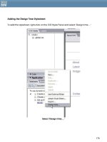
Create a New CSS Style, select the radio button for ‘Advanced’ and create it for an id
‘#albumlist’.
Creating styles for the id “albumlist”
In the CSS Style Definition Dialog, select the list category and set list type to ‘none’. This
removes the bullets on a list with this id.
Setting type to none
Click OK to close this dialog and create the id, then apply this id to the ul tag of the list of
photographs.
135
Applying the class albumlist to the ul tag
After applying the class the bullets should disappear from the list.
Next, create another new CSS style, this time define it for #albumlist li – that is, every li tag
within the id #albumlist.
Creating a class for albumlist li
After creating this class, go to the Box category of the dialog and set float to left.
136
Click OK and the photos should move up one next to another in the Design View:
After floating the li’s left
If you preview this in your browser, you will see that if you make the window wider and
smaller the photos will wrap according to how much space they have.
Creating space
Now that you have your basic grid layout, you will probably want to space out the
thumbnails. To do so, edit the CSS style for #albumlist li. Add a margin to the bottom and
right to give the images more space to their right and below them.
137
Adding padding to the class
To style the captions that are underneath the photographs, you simply style the type for
this class.
Styling the type of the image captions
138
Adding a border to the image
To add a border to the images, we can define a class for all img tags within #albumlist.
Create a new CSS style, for #albumlist img. In the Border category of the CSS Style
Definition dialog set border properties for the images.
Setting border properties for the images
You can experiment with the CSS for this album layout from this point, adding background
colors or other effects to the individual li tags, but if you look at the CSS that has been
created for this so far you will see that this is a very efficient way to create the grid effect
necessary.
#albumlist {
list-style-type: none;
}
#albumlist li {
float: left;
margin-right: 6px;
139
margin-bottom: 10px;
font-family: Arial, Helvetica, sans-serif;
font-size: 0.8em;
font-weight: bold;
color: #333333;
}
#albumlist img {
border: 1px solid #333300;
}
All we have added to the original document to create this effect is the application of the
albumlist id to the ul tag.
The photo album as displayed in the browser
Setting the width of the layout
The fact that the images will wrap to the size of the screen may be a plus point of this
method for some sites, however if you have a fixed width layout you may want to set the
width of the album grid to a certain list. To do so simply set the width on #albumlist.
140
Setting the width of #albumlist
This will then force the photographs to stay within their container, at the width you have
set. If the photographs are contained within another div that has a set width they should
also honor that width setting and not expand outside of the bounds of the container.
Centering the layout
You can center the layout by editing the CSS for #albumlist and setting margin-right to
auto and margin-left to auto in the Box Category.
141
Centering the layout
If you have set the album to a fixed width of 450 pixels and centered it on the page, it will
display like the image below in the browser.
Fixed width, centered photo album
142
You could lay out all kinds of page elements using this type of model. If you are not laying
out pictures, but rather blocks of text, you will need to experiment with setting heights and
widths on the list items in order that they remain with constant dimensions. The float
property is very useful, and learning how to use it will make your CSS layouts far more
interesting and flexible.
143
11. Centering Designs with CSS
One of the more frustrating aspects of CSS is centering our fixed designs effectively on the
page. I know this because it's a question people ask me quite often—and I’ve lost count of
the amount of times that I’ve seen this question asked on newsgroups and forums.
While CSS offers a logical means to center designs, the problem is with browser
implementation. No surprises there! It's more than a bit frustrating because with table-
based layouts this was a no-brainer. We'd simply use the align="center" attribute to center
the containing table, and the entire layout would then be centered.
So how do we achieve the same effect in CSS? The good news is that we can. The bad
news is that to center our content effectively, we have to employ a workaround in order
to support multiple browsers.
The Issue in Detail
Web design is as subject to the whims of the times as is fashion. At one point, even our
table-based designs were fixed and aligned to the left. Then, as higher screen resolutions
became commonplace, having our designs flush left with lots and lots of white space to
the right became bothersome.
So, we began to center our fixed designs, balancing the white space more effectively.
Other camps began to strongly advocate "fluid" or "liquid" designs—those designs that
flowed to fill the browser window. This technique became commonplace, but it, too, has
two major flaws. First, liquid design means less control of the overall design, and second,
managing text line lengths in a fluid design is difficult if not darned near impossible without
sacrificing some other aspect of the design.
Now, even with CSS layouts, there are still folks thinking about fixed versus fluid designs. The
new design at A List Apart, which is CSS-based, uses a fixed, centered design:
144
Simon Willison, a long time advocate of Web standards and a new member of the Web
Standards Project, wrote on his weblog this very week "In recent months, I've been seriously
reconsidering my preference for liquid layouts." You can check out the commentary and
the responses at
Interesting that this topic is
being revisited at this stage of the game!
So, for those of you interested in designing fixed-width designs and having them centered,
but using CSS to do it, this article is for you.
Centering the Right Way
The correct way to horizontally center a box (or "Layer" as Dreamweaver refers to
positioned boxes) is to set the left and right margins of a given box to a width of "auto".
This is going to be true of any box within your design that you'd like to center, not just the
containing box we're using to center the design itself.
#mainbox {
margin-left: auto;
margin-right: auto;
}
145
By doing this, any box will neatly center, and in complying browsers, it does. In fact, let's
go ahead and set up a box, then set if to use these properties and see what happens.
I'm using Dreamweaver MX 2004 for this, and I recommend you do, too. The reason is due
to several markup fixes that the 2004 version offers, as described in just a bit. If you don't
have MX 2004, you can download a trial version from the Macromedia web site. If you
want to use MX instead, don't worry, I've provided details about how to manage the
differences.
With Dreamweaver open and at the ready, follow these steps:
1. In Dreamweaver select File > New.
2. Be sure Basic page is highlighted, as is HTML.
3. Check the Make document XHTML compliant checkbox.
4. Click Create. Your XHTML file will be created.
5. Go ahead and save the document locally by selecting File > Save As and naming
the file. I called mine centering-auto.html.
6. With the document open in Split view, go to the Code view panel and inside the
body tags, type in the following code:
<div id="mainbox">
</div>
7. Go ahead and save your file.
146
If you're using Dreamweaver MX, and not 2004, it's possible that the XML prolog was
added to the document, and that the namespace is not included in the opening <html>
tag. You want to remove the prolog as it conflicts with the DOCTYPE switch in IE 6, which,
as you'll see in just a few minutes, can interfere with proper interpretation of the Box Model,
improperly displaying your box. So, look for a line of markup at the very top of your
document that looks like this:
<?xml version="1.0" encoding="UTF-8" ?>
Simply highlight and delete it. Then replace the <html> tag with:
<html xmlns="
Once you've done that, you can save the file. All this fuss reveals exactly how
understanding the languages with which we work and implementing them both as
authors and software developers creating products for web design should pay attention
to specifications—our lives will be so much easier as a result.
The basic markup we just created provides the structure for the division we're going to use
as our main content box.
Note that I'm using an ID, meaning that I cannot apply this ID anywhere else in the
document. IDs are purposely meant to uniquely identify one specific element within a
page. This allows them to be accessed via scripting and IDs are frequently used for layout
boxes because we only want one type of box per page such as a box for our header,
footer, content, navigation and so on.
Now we'll style the box. To do so, follow these steps:
1. If your CSS Styles within the Design panel isn't open, select Window > CSS Styles to
open the CSS Styles tab.
2. In the CSS Styles tab, click the New CSS Style Button. The new CSS Styles dialog
appears.
3. In the Selector textbox, type in the ID name #mainbox.
4. Under Selector Type, click the Advanced radio button.
5. Choose This document only for the Define in option.
147
6. Click OK. The CSS Style Definition dialog appears.
7. Under Category, highlight Box. This brings up the properties available for the box.
8. In the Width textbox, enter a width of 595.
9. In the Height textbox, enter a height of 400. These are arbitrary numbers just for the
purposes of this exercise. When you're creating your containing box, you'll follow the
width your design requires, and you'll probably leave the height out as the content
will determine the height.
10. Under Margin, uncheck the Same for all checkbox. This will make all the Margin
options active.
11. In the textbox next to Right, choose auto from the drop-down menu.
12. In the textbox next to Left, choose auto from the drop-down.
13. Move to the Border Category, and let's give the box a 1 pixel black solid border so
we can see it as we work with it. Under Style, choose Solid from the drop-down
menu, Under Width, enter 1 into the textbox, and under Color, choose black.
14. Click OK.
148
Your box is centered! Or is it? Well, if you look in Mozilla, it is:
Centred in Mozilla
And if you look in IE 6 it is:
Centered in IE6
149
WARNING: If you take out the DOCTYPE declaration, the box in IE 6 will be left-aligned
because without the DOCTYPE declaration in place, the browser operates in "quirks" mode
rather than "standards" mode—something you can learn more about in the chapter
“DOCTYPE SWITCHING IN MX" This is one reason I‘m using Dreamweaver MX 2004—the
DOCTYPEs in 2004 are all happily corrected and the basic templates do not generate the
XML prolog—two nice improvements that the new version offers.
Opera 7 has no trouble properly rendering the centered box, either. But if you look in IE 5.0
(as shown here) or Netscape 4.x or many other browsers, the box is not centered:
CSS Centering Doesn't Work in IE 5.0
So, the conclusion here is that the correct way to center your containing box may not
provide you with the backward compatibility you require.
Centering the Wrong Way
So, as the sorry state of browser affairs may disallow us to use the correct CSS to manage
our containing boxes, we have to look at workarounds or hacks. The most common one in
use is to apply the text-align property to the document body, setting the alignment to a
value of "center". This technique will work in a wider range of browsers, and will even work
in cases where you don't have a proper DOCTYPE (but of course you should).
The workaround is controversial for a number of reasons, at least to hardcore markup
junkies:
150
• We're applying a property meant for text, not for positioning, so we're not using the
language correctly, which is why this is considered a hack.
• We're going to have to write extra CSS to override the text-align: center property,
because we're going to be using the text-align: center property on the body
element. So, any text within the body is now going to be—guess what—aligned to
the center.
To apply the text-align hack for centering, follow these steps in Dreamweaver:
1. Select File > New. Choose a Basic HTML page and check the Make document
XHTML compliant checkbox.
2. Click Create.
3. Add the same markup we used to create the box in the last exercise within the
body tags:
<div id="mainbox">
</div>
4. Save your file, I named this one centering-hack.html.
With your XHTML document at the ready, let's go ahead and add the box and the hack.
To do so, follow these steps:
1. From the CSS Styles tab within the Design panel, click the New CSS Style button.
2. In the New CSS Style dialog, add #mainbox to the Selector field.
3. Click Advanced for Selector Type.
4. Click This document only for the Define in option.
5. Click OK. The CSS Style Definition dialog appears.
6. Now go to the Box Category, and set up your main box with a width of 595 and a
height of 400. Leave the Padding and Margin options as is.
7. Add a border using the Border Category. Let's have some fun this time, I made my
border dashed, 2 pixels wide, and red.
8. Click OK.
9. Click the New CSS Style button again.
10. In the New CSS Style dialog, add body to the Selector field.
151
11. Click Tag for Selector Type.
12. Click This document only for the Define in option.
13. Click OK.
14. In the CSS Style Definition dialog, highlight the block category.
15. For the Text align option, choose center from the drop-down menu.
16. Click OK.
Your box is now centered! Or is it?
In IE 6 it is. In IE 6 even without the DOCTYPE declaration it is. In Netscape 4.x it is (even
though the height and border styles aren't supported):
Centering Hack in Mozilla doesn't work.
152
But in Mozilla and Opera (shown here), the box isn't centered. That's not a fault of those
browsers by the way, it's because they're rendering the CSS properly. We're using a hack,
remember?
Centering Hack in Opera doesn't work.
So now what?
One Right and One Wrong Equals Compatibility
To make your containing box as cross-browser compatible as possible, you have to use
both the right way and the hack. To do this, simply go ahead and copy the style for body
from the centering-hack.html document and paste it into the centering-auto.html
document, saving that document as centering-combined.html.
Here's what the markup for the workaround looks like:
<!DOCTYPE html PUBLIC "-//W3C//DTD XHTML 1.0 Transitional//EN"
"
<html xmlns="
<head>
<title>Centering Boxes: The Right Way</title>
<meta http-equiv="Content-Type" content="text/html; charset=iso-8859-1"
/>
<style type="text/css">
153


